The Chart Class#
The Chart module is a base class for modules that implement charts in
XlsxWriter. The information in this section is applicable to all of the
available chart subclasses, such as Area, Bar, Column, Doughnut, Line, Pie,
Scatter, Stock and Radar.
A chart object is created via the Workbook add_chart() method where the
chart type is specified:
chart = workbook.add_chart({'type': 'column'})
It is then inserted into a worksheet as an embedded chart using the
insert_chart() Worksheet method:
worksheet.insert_chart('A7', chart)
Or it can be set in a chartsheet using the set_chart() Chartsheet method:
chartsheet = workbook.add_chartsheet()
# ...
chartsheet.set_chart(chart)
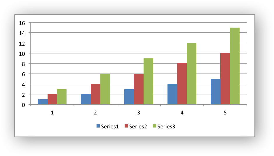
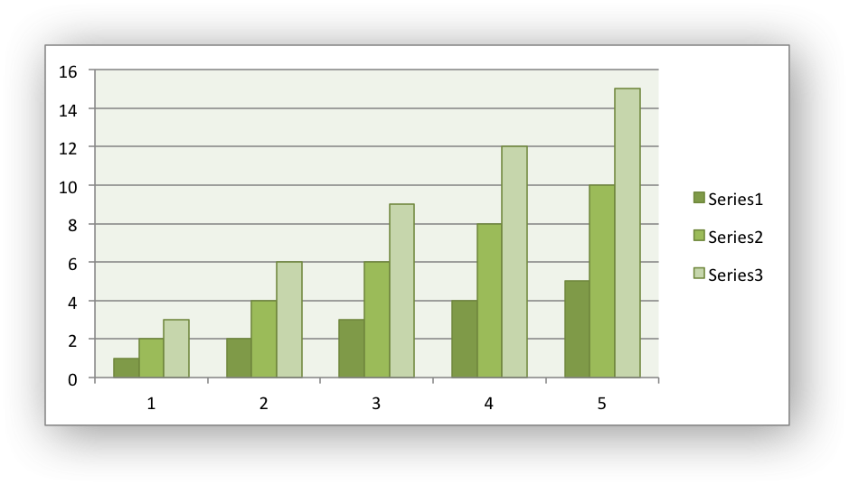
The following is a small working example or adding an embedded chart:
import xlsxwriter

workbook = xlsxwriter.Workbook('chart.xlsx')
worksheet = workbook.add_worksheet()

# Create a new Chart object.
chart = workbook.add_chart({'type': 'column'})

# Write some data to add to plot on the chart.
data = [
    [1, 2, 3, 4, 5],
    [2, 4, 6, 8, 10],
    [3, 6, 9, 12, 15],
]

worksheet.write_column('A1', data[0])
worksheet.write_column('B1', data[1])
worksheet.write_column('C1', data[2])

# Configure the chart. In simplest case we add one or more data series.
chart.add_series({'values': '=Sheet1!$A$1:$A$5'})
chart.add_series({'values': '=Sheet1!$B$1:$B$5'})
chart.add_series({'values': '=Sheet1!$C$1:$C$5'})

# Insert the chart into the worksheet.
worksheet.insert_chart('A7', chart)

workbook.close()

The supported chart types are:
area: Creates an Area (filled line) style chart.bar: Creates a Bar style (transposed histogram) chart.column: Creates a column style (histogram) chart.line: Creates a Line style chart.pie: Creates a Pie style chart.doughnut: Creates a Doughnut style chart.scatter: Creates a Scatter style chart.stock: Creates a Stock style chart.radar: Creates a Radar style chart.
Chart subtypes are also supported for some chart types:
workbook.add_chart({'type': 'bar', 'subtype': 'stacked'})
The available subtypes are:
area
    stacked
    percent_stacked

bar
    stacked
    percent_stacked

column
    stacked
    percent_stacked

scatter
    straight_with_markers
    straight
    smooth_with_markers
    smooth

line
    stacked
    percent_stacked

radar
    with_markers
    filled
Methods that are common to all chart types are documented below. See Working with Charts for chart specific information.
chart.add_series()#
- add_series(options)#
Add a data series to a chart.
- Parameters:
options (dict) – A dictionary of chart series options.
In Excel a chart series is a collection of information that defines which data is plotted such as values, axis labels and formatting.
For an XlsxWriter chart object the add_series() method is used to set the
properties for a series:
chart.add_series({
    'categories': '=Sheet1!$A$1:$A$5',
    'values':     '=Sheet1!$B$1:$B$5',
    'line':       {'color': 'red'},
})

# Or using a list of values instead of category/value formulas:
#     [sheetname, first_row, first_col, last_row, last_col]
chart.add_series({
    'categories': ['Sheet1', 0, 0, 4, 0],
    'values':     ['Sheet1', 0, 1, 4, 1],
    'line':       {'color': 'red'},
})
As shown above the categories and values can take either a range
formula such as =Sheet1!$A$2:$A$7 or, more usefully when generating the
range programmatically, a list with zero indexed row/column values.
The series options that can be set are:
values: This is the most important property of a series and is the only mandatory option for every chart object. This option links the chart with the worksheet data that it displays. The data range can be set using a formula as shown in the first example above or using a list of values as shown in the second example.categories: This sets the chart category labels. The category is more or less the same as the X axis. In most chart types thecategoriesproperty is optional and the chart will just assume a sequential series from1..n.name: Set the name for the series. The name is displayed in the formula bar. For non-Pie/Doughnut charts it is also displayed in the legend. The name property is optional and if it isn’t supplied it will default toSeries 1..n. The name can also be a formula such as=Sheet1!$A$1or a list with a sheetname, row and column such as['Sheet1', 0, 0].line: Set the properties of the series line type such as color and width. See Chart formatting: Line.border: Set the border properties of the series such as color and style. See Chart formatting: Border.fill: Set the solid fill properties of the series such as color. See Chart formatting: Solid Fill.pattern: Set the pattern fill properties of the series. See Chart formatting: Pattern Fill.gradient: Set the gradient fill properties of the series. See Chart formatting: Gradient Fill.marker: Set the properties of the series marker such as style and color. See Chart series option: Marker.trendline: Set the properties of the series trendline such as linear, polynomial and moving average types. See Chart series option: Trendline.smooth: Set the smooth property of a line series.y_error_bars: Set vertical error bounds for a chart series. See Chart series option: Error Bars.x_error_bars: Set horizontal error bounds for a chart series. See Chart series option: Error Bars.data_labels: Set data labels for the series. See Chart series option: Data Labels.points: Set properties for individual points in a series. See Chart series option: Points.invert_if_negative: Invert the fill color for negative values. Usually only applicable to column and bar charts.overlap: Set the overlap between series in a Bar/Column chart. The range is +/- 100. The default is 0:chart.add_series({ 'categories': '=Sheet1!$A$1:$A$5', 'values': '=Sheet1!$B$1:$B$5', 'overlap': 10, })
Note, it is only necessary to apply the
overlapproperty to one series in the chart.gap: Set the gap between series in a Bar/Column chart. The range is 0 to 500. The default is 150:chart.add_series({ 'categories': '=Sheet1!$A$1:$A$5', 'values': '=Sheet1!$B$1:$B$5', 'gap': 200, })
Note, it is only necessary to apply the
gapproperty to one series in the chart.
More than one series can be added to a chart. In fact, some chart types such as
stock require it. The series numbering and order in the Excel chart will
be the same as the order in which they are added in XlsxWriter.
It is also possible to specify non-contiguous ranges:
chart.add_series({
    'categories': '=(Sheet1!$A$1:$A$9,Sheet1!$A$14:$A$25)',
    'values':     '=(Sheet1!$B$1:$B$9,Sheet1!$B$14:$B$25)',
})
chart.set_x_axis()#
- set_x_axis(options)#
Set the chart X axis options.
- Parameters:
options (dict) – A dictionary of axis options.
The set_x_axis() method is used to set properties of the X axis:
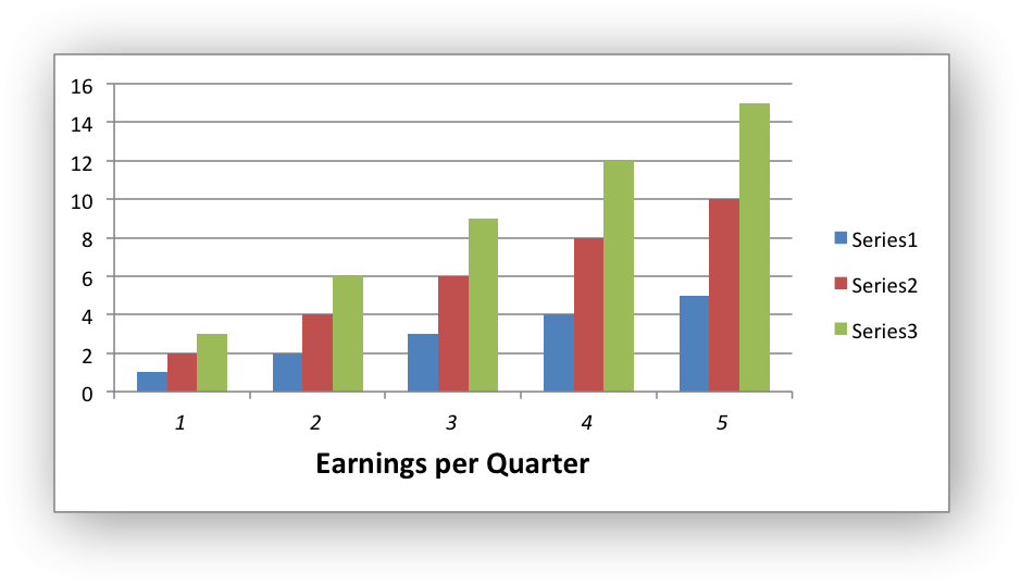
chart.set_x_axis({
    'name': 'Earnings per Quarter',
    'name_font': {'size': 14, 'bold': True},
    'num_font':  {'italic': True },
})
The options that can be set are:
name
name_layout
name_font
name_line
name_fill
name_pattern
name_gradient
line
fill
pattern
gradient
num_format
num_font
min
max
minor_unit
major_unit
interval_unit
interval_tick
crossing
position_axis
reverse
log_base
label_position
label_align
major_gridlines
minor_gridlines
visible
date_axis
text_axis
minor_unit_type
major_unit_type
minor_tick_mark
major_tick_mark
display_units
display_units_visible
These options are explained below. Some properties are only applicable to value, category or date axes (this is noted in each case). See Chart Value and Category Axes for an explanation of Excel’s distinction between the axis types.
name: Set the name (also known as title or caption) for the axis. The name is displayed below the X axis. (Applicable to category, date and value axes.):chart.set_x_axis({'name': 'Earnings per Quarter'})
This property is optional. The default is to have no axis name.
The name can also be a formula such as
=Sheet1!$A$1or a list with a sheetname, row and column such as['Sheet1', 0, 0].name_font: Set the font properties for the axis name. (Applicable to category, date and value axes.):chart.set_x_axis({'name_font': {'bold': True, 'italic': True}})
See the Chart Fonts section for more details on font properties.
name_line: Set the properties of the axis title/name border type such as color and width. See Chart formatting: Line.name_fill: Set the solid fill properties of the axis title/name. See Chart formatting: Solid Fill.name_pattern: Set the pattern fill properties of the axis title/name. See Chart formatting: Pattern Fill.name_gradient: Set the gradient fill properties of the axis title/name. See Chart formatting: Gradient Fill.name_layout: Set the(x, y)position of the axis caption in chart relative units. (Applicable to category, date and value axes.):chart.set_x_axis({ 'name': 'X axis', 'name_layout': { 'x': 0.34, 'y': 0.85, } })
See the Chart Layout section for more details.
num_font: Set the font properties for the axis numbers. (Applicable to category, date and value axes.):chart.set_x_axis({'name_font': {'bold': True, 'italic': True}})
See the Chart Fonts section for more details on font properties.
num_format: Set the number format for the axis. (Applicable to category, date and value axes.):chart.set_x_axis({'num_format': '#,##0.00'}) chart.set_y_axis({'num_format': '0.00%'})
The number format is similar to the Worksheet Cell Format
num_formatapart from the fact that a format index cannot be used. An explicit format string must be used as shown above. Seeset_num_format()for more information.line: Set the properties of the axis line type such as color and width. See Chart formatting: Line:chart.set_x_axis({'line': {'none': True}})
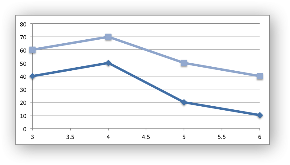
fill: Set the solid fill properties of the axis. See Chart formatting: Solid Fill. Note, in Excel the axis fill is applied to the area of the numbers of the axis and not to the area of the axis bounding box. That background is set from the chartarea fill.pattern: Set the pattern fill properties of the axis. See Chart formatting: Pattern Fill.gradient: Set the gradient fill properties of the axis. See Chart formatting: Gradient Fill.min: Set the minimum value for the axis range. (Applicable to value and date axes only.):chart.set_x_axis({'min': 3, 'max': 6})
max: Set the maximum value for the axis range. (Applicable to value and date axes only.)minor_unit: Set the increment of the minor units in the axis range. (Applicable to value and date axes only.):chart.set_x_axis({'minor_unit': 0.4, 'major_unit': 2})
major_unit: Set the increment of the major units in the axis range. (Applicable to value and date axes only.)interval_unit: Set the interval unit for a category axis. Should be an integer value. (Applicable to category axes only.):chart.set_x_axis({'interval_unit': 5})
interval_tick: Set the tick interval for a category axis. Should be an integer value. (Applicable to category axes only.):chart.set_x_axis({'interval_tick': 2})
crossing: Set the position where the y axis will cross the x axis. (Applicable to all axes.)The
crossingvalue can be a numeric value or the strings'max'or'min'to set the crossing at the maximum/minimum axis:chart.set_x_axis({'crossing': 3}) chart.set_y_axis({'crossing': 'max'})
For category axes the numeric value must be an integer to represent the category number that the axis crosses at. For value and date axes it can have any value associated with the axis. See also Chart Value and Category Axes.
If crossing is omitted (the default) the crossing will be set automatically by Excel based on the chart data.
position_axis: Position the axis on or between the axis tick marks. (Applicable to category axes only.)There are two allowable values
on_tickandbetween:chart.set_x_axis({'position_axis': 'on_tick'}) chart.set_x_axis({'position_axis': 'between'})
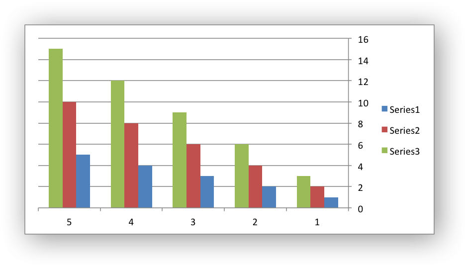
reverse: Reverse the order of the axis categories or values. (Applicable to category, date and value axes.):chart.set_x_axis({'reverse': True})
log_base: Set the log base of the axis range. (Applicable to value axes only.):chart.set_y_axis({'log_base': 10})
label_position: Set the “Axis labels” position for the axis. The following positions are available:next_to (the default) high low none
For example:
chart.set_x_axis({'label_position': 'high'})
chart.set_y_axis({'label_position': 'low'})
label_align: Align the “Axis labels” the axis. (Applicable to category axes only.)The following Excel alignments are available:
center (the default)
right
left
For example:
chart.set_x_axis({'label_align': 'left'})
major_gridlines: Configure the major gridlines for the axis. The available properties are:visible line
For example:
chart.set_x_axis({
    'major_gridlines': {
        'visible': True,
        'line': {'width': 1.25, 'dash_type': 'dash'}
    },
})
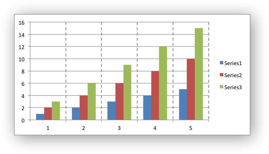
The
visibleproperty is usually on for the X axis but it depends on the type of chart.The
lineproperty sets the gridline properties such as color and width. See Chart Formatting.minor_gridlines: This takes the same options asmajor_gridlinesabove.The minor gridline
visibleproperty is off by default for all chart types.visible: Configure the visibility of the axis:chart.set_y_axis({'visible': False})
Axes are visible by default.
date_axis: This option is used to treat a category axis with date or time data as a Date Axis. (Applicable to date category axes only.):chart.set_x_axis({'date_axis': True})
This option also allows you to set
maxandminvalues for a category axis which isn’t allowed by Excel for non-date category axes.See Date Category Axes for more details.
text_axis: This option is used to treat a category axis explicitly as a Text Axis. (Applicable to category axes only.):chart.set_x_axis({'text_axis': True})
minor_unit_type: Fordate_axisaxes, see above, this option is used to set the type of the minor units. (Applicable to date category axes only.):chart.set_x_axis({ 'date_axis': True, 'minor_unit': 4, 'minor_unit_type': 'months', })
major_unit_type: Same asminor_unit_type, see above, but for major axes unit types.minor_tick_mark: Set the axis minor tick mark type/position to one of the following values:none inside outside cross (inside and outside)
For example:
chart.set_x_axis({'major_tick_mark': 'none',
                  'minor_tick_mark': 'inside'})
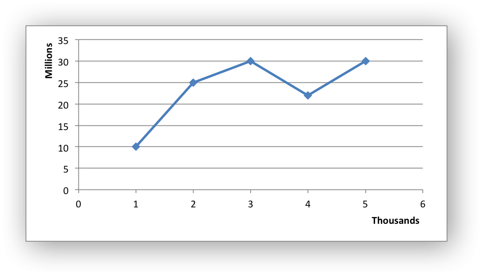
major_tick_mark: Same asminor_tick_mark, see above, but for major axes ticks.display_units: Set the display units for the axis. This can be useful if the axis numbers are very large but you don’t want to represent them in scientific notation. The available display units are:hundreds thousands ten_thousands hundred_thousands millions ten_millions hundred_millions billions trillions
Applicable to value axes only.:
chart.set_x_axis({'display_units': 'thousands'})
chart.set_y_axis({'display_units': 'millions'})
display_units_visible: Control the visibility of the display units turned on by the previous option. This option is on by default. (Applicable to value axes only.):chart.set_x_axis({'display_units': 'hundreds', 'display_units_visible': False})
chart.set_y_axis()#
- set_y_axis(options)#
Set the chart Y axis options.
- Parameters:
options (dict) – A dictionary of axis options.
The set_y_axis() method is used to set properties of the Y axis.
The properties that can be set are the same as for set_x_axis, see above.
chart.set_x2_axis()#
- set_x2_axis(options)#
Set the chart secondary X axis options.
- Parameters:
options (dict) – A dictionary of axis options.
The set_x2_axis() method is used to set properties of the secondary X axis,
see chart_secondary_axes().
The properties that can be set are the same as for set_x_axis, see above.
The default properties for this axis are:
'label_position': 'none',
'crossing':       'max',
'visible':        False,
chart.set_y2_axis()#
- set_y2_axis(options)#
Set the chart secondary Y axis options.
- Parameters:
options (dict) – A dictionary of axis options.
The set_y2_axis() method is used to set properties of the secondary Y axis,
see chart_secondary_axes().
The properties that can be set are the same as for set_x_axis, see above.
The default properties for this axis are:
'major_gridlines': {'visible': True}
chart.combine()#
- combine(chart)#
Combine two charts of different types.
- Parameters:
chart – A chart object created with
add_chart().
The chart combine() method is used to combine two charts of different
types, for example a column and line chart:
# Create a primary chart.
column_chart = workbook.add_chart({'type': 'column'})
column_chart.add_series({...})

# Create a secondary chart.
line_chart = workbook.add_chart({'type': 'line'})
line_chart.add_series({...})

# Combine the charts.
column_chart.combine(line_chart)
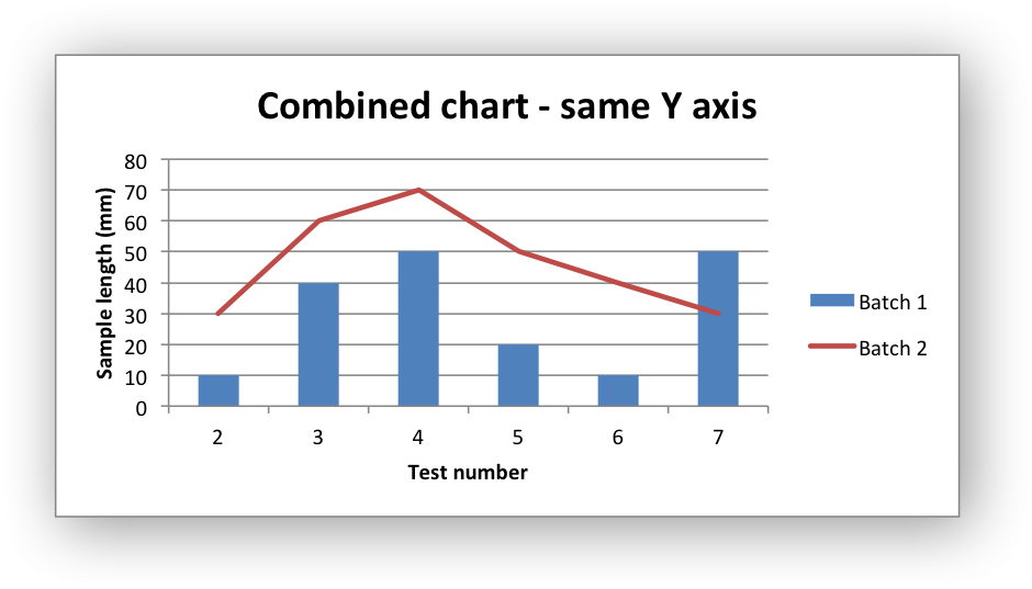
See the Combined Charts section for more details.
chart.set_size()#
The set_size() method is used to set the dimensions of the chart. The size
properties that can be set are:
width
height
x_scale
y_scale
x_offset
y_offset
The width and height are in pixels. The default chart width x height is
480 x 288 pixels. The size of the chart can be modified by setting the
width and height or by setting the x_scale and y_scale:
chart.set_size({'width': 720, 'height': 576})
# Same as:
chart.set_size({'x_scale': 1.5, 'y_scale': 2})
The x_offset and y_offset position the top left corner of the chart in
the cell that it is inserted into.
Note: the x_offset and y_offset parameters can also be set via the
insert_chart() method:
worksheet.insert_chart('E2', chart, {'x_offset': 25, 'y_offset': 10})
chart.set_title()#
- set_title(options)#
Set the chart title options.
- Parameters:
options (dict) – A dictionary of chart size options.
The set_title() method is used to set properties of the chart title:
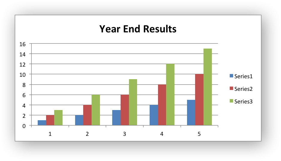
chart.set_title({'name': 'Year End Results'})
The properties that can be set are:
name: Set the name (title) for the chart. The name is displayed above the chart. The name can also be a formula such as=Sheet1!$A$1or a list with a sheetname, row and column such as['Sheet1', 0, 0]. The name property is optional. The default is to have no chart title.font: Set the font properties for the chart title. See Chart Fonts.border: Set the border properties of the legend such as color and style. See Chart formatting: Border.fill: Set the solid fill properties of the legend such as color. See Chart formatting: Solid Fill.pattern: Set the pattern fill properties of the legend. See Chart formatting: Pattern Fill.gradient: Set the gradient fill properties of the legend. See Chart formatting: Gradient Fill.overlay: Allow the title to be overlaid on the chart. Generally used with the layout property below.layout: Set the(x, y)position of the title in chart relative units:chart.set_title({ 'name': 'Title', 'overlay': True, 'layout': { 'x': 0.42, 'y': 0.14, } })
See the Chart Layout section for more details.
none: By default Excel adds an automatic chart title to charts with a single series and a user defined series name. Thenoneoption turns this default title off. It also turns off all otherset_title()options:chart.set_title({'none': True})
chart.set_legend()#
- set_legend(options)#
Set the chart legend options.
- Parameters:
options (dict) – A dictionary of chart legend options.
The set_legend() method is used to set properties of the chart legend. For
example it can be used to turn off the default chart legend:
chart.set_legend({'none': True})
The options that can be set are:
none
position
font
border
fill
pattern
gradient
delete_series
layout
none: In Excel chart legends are on by default. Thenoneoption turns off the chart legend:chart.set_legend({'none': True})
For backward compatibility, it is also possible to turn off the legend via the
positionproperty:chart.set_legend({'position': 'none'})
position: Set the position of the chart legend:chart.set_legend({'position': 'bottom'})
The default legend position is
right. The available positions are:top bottom left right overlay_left overlay_right none
font: Set the font properties of the chart legend:chart.set_legend({'font': {'size': 9, 'bold': True}})
See the Chart Fonts section for more details on font properties.
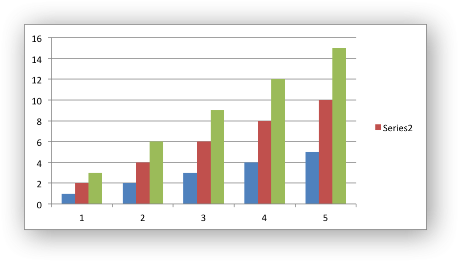
border: Set the border properties of the legend such as color and style. See Chart formatting: Border.fill: Set the solid fill properties of the legend such as color. See Chart formatting: Solid Fill.pattern: Set the pattern fill properties of the legend. See Chart formatting: Pattern Fill.gradient: Set the gradient fill properties of the legend. See Chart formatting: Gradient Fill.delete_series: This allows you to remove one or more series from the legend (the series will still display on the chart). This property takes a list as an argument and the series are zero indexed:# Delete/hide series index 0 and 2 from the legend. chart.set_legend({'delete_series': [0, 2]})
layout: Set the(x, y)position of the legend in chart relative units:chart.set_legend({ 'layout': { 'x': 0.80, 'y': 0.37, 'width': 0.12, 'height': 0.25, } })
See the Chart Layout section for more details.
chart.set_chartarea()#
- set_chartarea(options)#
Set the chart area options.
- Parameters:
options (dict) – A dictionary of chart area options.
The set_chartarea() method is used to set the properties of the chart area.
In Excel the chart area is the background area behind the chart:
chart.set_chartarea({
    'border': {'none': True},
    'fill':   {'color': 'red'}
})
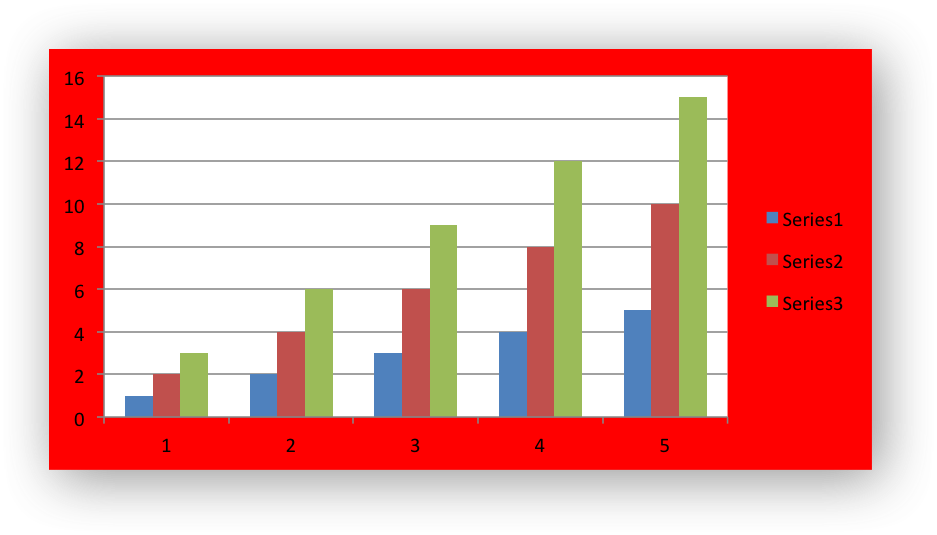
The properties that can be set are:
border: Set the border properties of the chartarea such as color and style. See Chart formatting: Border.fill: Set the solid fill properties of the chartarea such as color. See Chart formatting: Solid Fill.pattern: Set the pattern fill properties of the chartarea. See Chart formatting: Pattern Fill.gradient: Set the gradient fill properties of the chartarea. See Chart formatting: Gradient Fill.
chart.set_plotarea()#
- set_plotarea(options)#
Set the plot area options.
- Parameters:
options (dict) – A dictionary of plot area options.
The set_plotarea() method is used to set properties of the plot area of a
chart. In Excel the plot area is the area between the axes on which the chart
series are plotted:
chart.set_plotarea({
    'border': {'color': 'red', 'width': 2, 'dash_type': 'dash'},
    'fill':   {'color': '#FFFFC2'}
})
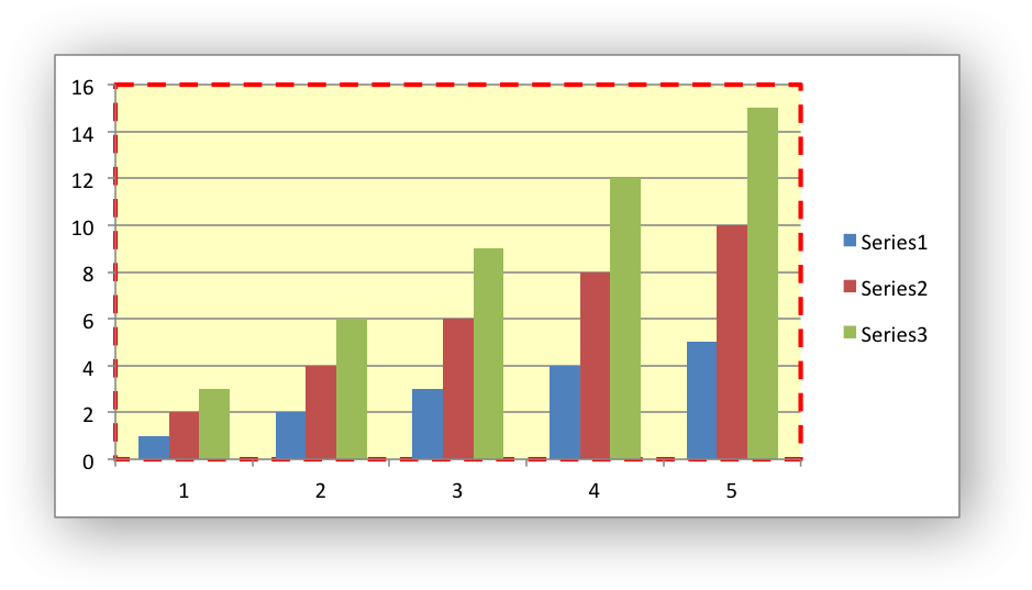
The properties that can be set are:
border: Set the border properties of the plotarea such as color and style. See Chart formatting: Border.fill: Set the solid fill properties of the plotarea such as color. See Chart formatting: Solid Fill.pattern: Set the pattern fill properties of the plotarea. See Chart formatting: Pattern Fill.gradient: Set the gradient fill properties of the plotarea. See Chart formatting: Gradient Fill.layout: Set the(x, y)position of the plotarea in chart relative units:chart.set_plotarea({ 'layout': { 'x': 0.13, 'y': 0.26, 'width': 0.73, 'height': 0.57, } })
See the Chart Layout section for more details.
chart.set_style()#
- set_style(style_id)#
Set the chart style type.
- Parameters:
style_id (int) – An index representing the chart style.
The set_style() method is used to set the style of the chart to one of the
48 built-in styles available on the ‘Design’ tab in Excel:
chart.set_style(37)
The style index number is counted from 1 on the top left. The default style is 2.
Note
In Excel 2013 the Styles section of the ‘Design’ tab in Excel shows what
were referred to as ‘Layouts’ in previous versions of Excel. These layouts
are not defined in the file format. They are a collection of modifications
to the base chart type. They can be replicated using the XlsxWriter Chart
API but they cannot be defined by the set_style() method.
chart.set_table()#
- set_table(options)#
Set properties for an axis data table.
- Parameters:
options (dict) – A dictionary of axis table options.
The set_table() method adds a data table below the horizontal axis with the
data used to plot the chart:
chart.set_table()
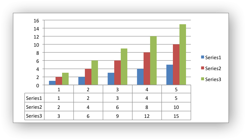
The available options, with default values are:
'horizontal': True   # Display vertical lines in the table.
'vertical':   True   # Display horizontal lines in the table.
'outline':    True   # Display an outline in the table.
'show_keys':  False  # Show the legend keys with the table data.
'font':       {}     # Standard chart font properties.
For example:
chart.set_table({'show_keys': True})
The data table can only be shown with Bar, Column, Line, Area and stock charts. See the Chart Fonts section for more details on font properties.
chart.set_up_down_bars()#
- set_up_down_bars(options)#
Set properties for the chart up-down bars.
- Parameters:
options (dict) – A dictionary of options.
The set_up_down_bars() method adds Up-Down bars to Line charts to indicate
the difference between the first and last data series:
chart.set_up_down_bars()
It is possible to format the up and down bars to add fill, pattern or
gradient and border properties if required. See
Chart Formatting:
chart.set_up_down_bars({
    'up': {
        'fill':   {'color': '#00B050'},
        'border': {'color': 'black'}
    },
    'down': {
        'fill':   {'color': 'red'},
        'border': {'color': 'black'},
    },
})
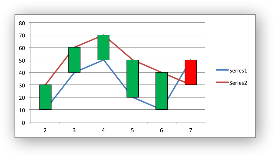
Up-down bars can only be applied to Line charts and to Stock charts (by default).
chart.set_drop_lines()#
- set_drop_lines(options)#
Set properties for the chart drop lines.
- Parameters:
options (dict) – A dictionary of options.
The set_drop_lines() method adds Drop Lines to charts to show the Category
value of points in the data:
chart.set_drop_lines()
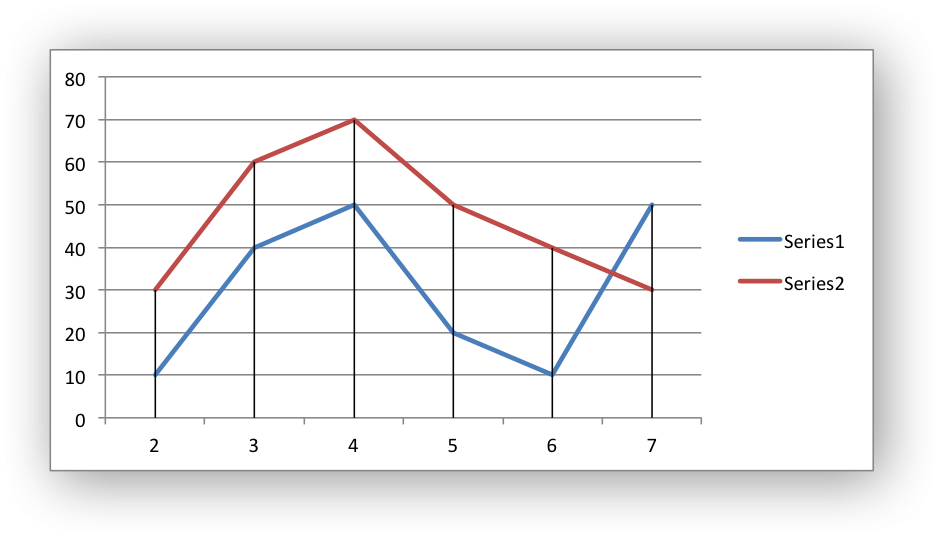
It is possible to format the Drop Line line properties if required. See
Chart Formatting:
chart.set_drop_lines({'line': {'color': 'red',
                               'dash_type': 'square_dot'}})
Drop Lines are only available in Line, Area and Stock charts.
chart.set_high_low_lines()#
- set_high_low_lines(options)#
Set properties for the chart high-low lines.
- Parameters:
options (dict) – A dictionary of options.
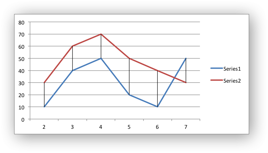
The set_high_low_lines() method adds High-Low lines to charts to show the
maximum and minimum values of points in a Category:
chart.set_high_low_lines()
It is possible to format the High-Low Line line properties if required. See
Chart Formatting:
chart.set_high_low_lines({
    'line': {
        'color': 'red',
        'dash_type': 'square_dot'
    }
})
High-Low Lines are only available in Line and Stock charts.
chart.show_blanks_as()#
- show_blanks_as(option)#
Set the option for displaying blank/empty data cells in a chart.
- Parameters:
option (string) – A string representing the display option.
The show_blanks_as() method controls how blank/empty data is displayed in a
chart:
chart.show_blanks_as('span')
The available options are:
'gap'   # Blank data is shown as a gap. The default.
'zero'  # Blank data is displayed as zero.
'span'  # Blank data is connected with a line.
chart.show_na_as_empty_cell()#
- show_na_as_empty_cell()#
Display
#N/Aon charts as blank/empty cells.
Display #N/A values on a chart as blank/empty cells.:
chart.show_na_as_empty_cell()
chart.set_rotation()#
- set_rotation(rotation)
Set the Pie/Doughnut chart rotation.
- Parameters:
rotation (int) – The angle of rotation.
The set_rotation() method is used to set the rotation of the first segment
of a Pie/Doughnut chart. This has the effect of rotating the entire chart:
chart->set_rotation(90)
The angle of rotation must be in the range 0 <= rotation <= 360.
This option is only available for Pie/Doughnut charts.
chart.set_hole_size()#
- set_hole_size(size)#
Set the Doughnut chart hole size.
- Parameters:
size (int) – The hole size as a percentage.
The set_hole_size() method is used to set the hole size of a Doughnut
chart:
chart->set_hole_size(33)
The value of the hole size must be in the range 10 <= size <= 90.
This option is only available for Doughnut charts.
See also Working with Charts and Chart Examples.