Example: Polars Excel output with a chart#
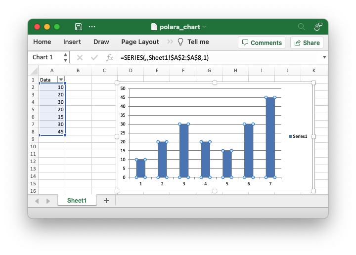
An example of adding a Polars dataframe to a worksheet created by XlsxWriter and then adding a chart of the data. See Working with Polars and XlsxWriter for more details.
##############################################################################
#
# An example of adding a Polars dataframe to a worksheet created by XlsxWriter
# and then adding a chart of the data.
#
# SPDX-License-Identifier: BSD-2-Clause
#
# Copyright (c) 2013-2025, John McNamara, jmcnamara@cpan.org
#

import polars as pl

import xlsxwriter

df = pl.DataFrame({"Data": [10, 20, 30, 20, 15, 30, 45]})

with xlsxwriter.Workbook("polars_chart.xlsx") as workbook:
    # Create the worksheet so we can reuse it later.
    worksheet = workbook.add_worksheet()

    # Write the Polars data to the worksheet created above.
    df.write_excel(workbook=workbook, worksheet="Sheet1")

    # Create a chart object.
    chart = workbook.add_chart({"type": "column"})

    # Get the dimensions of the dataframe.
    (max_row, max_col) = df.shape

    # Configure the series of the chart from the dataframe data.
    chart.add_series({"values": ["Sheet1", 1, max_col - 1, max_row, max_col - 1]})

    # Insert the chart into the worksheet.
    worksheet.insert_chart(1, 3, chart)