Working with Charts#
This section explains how to work with some of the options and features of The Chart Class.
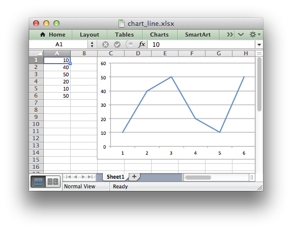
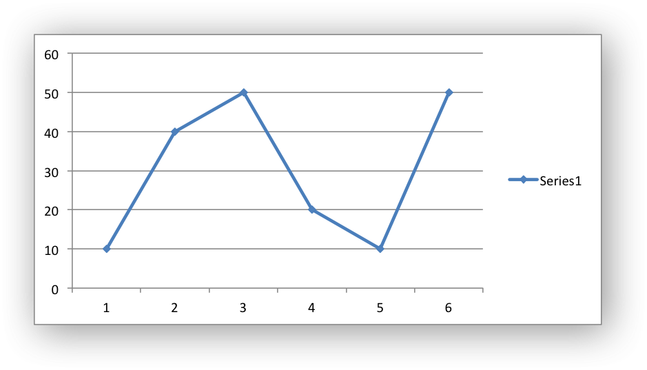
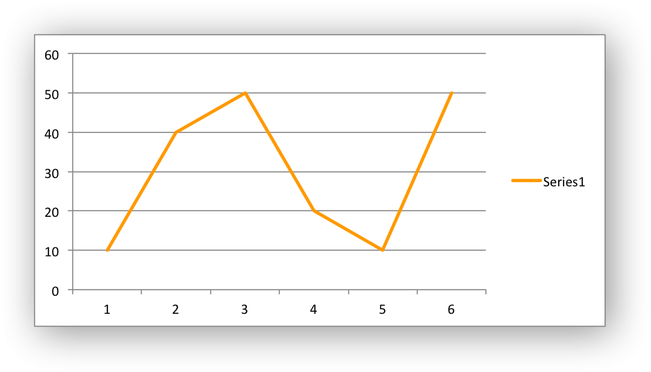
The majority of the examples in this section are based on a variation of the following program:
import xlsxwriter
workbook = xlsxwriter.Workbook('chart_line.xlsx')
worksheet = workbook.add_worksheet()
# Add the worksheet data to be plotted.
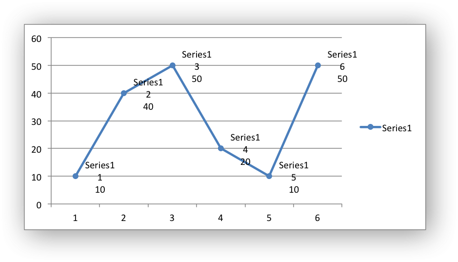
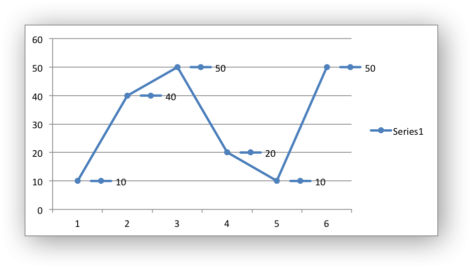
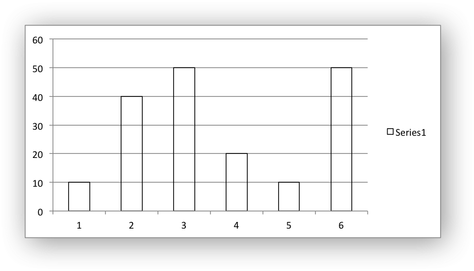
data = [10, 40, 50, 20, 10, 50]
worksheet.write_column('A1', data)
# Create a new chart object.
chart = workbook.add_chart({'type': 'line'})
# Add a series to the chart.
chart.add_series({'values': '=Sheet1!$A$1:$A$6'})
# Insert the chart into the worksheet.
worksheet.insert_chart('C1', chart)
workbook.close()
See also Chart Examples.
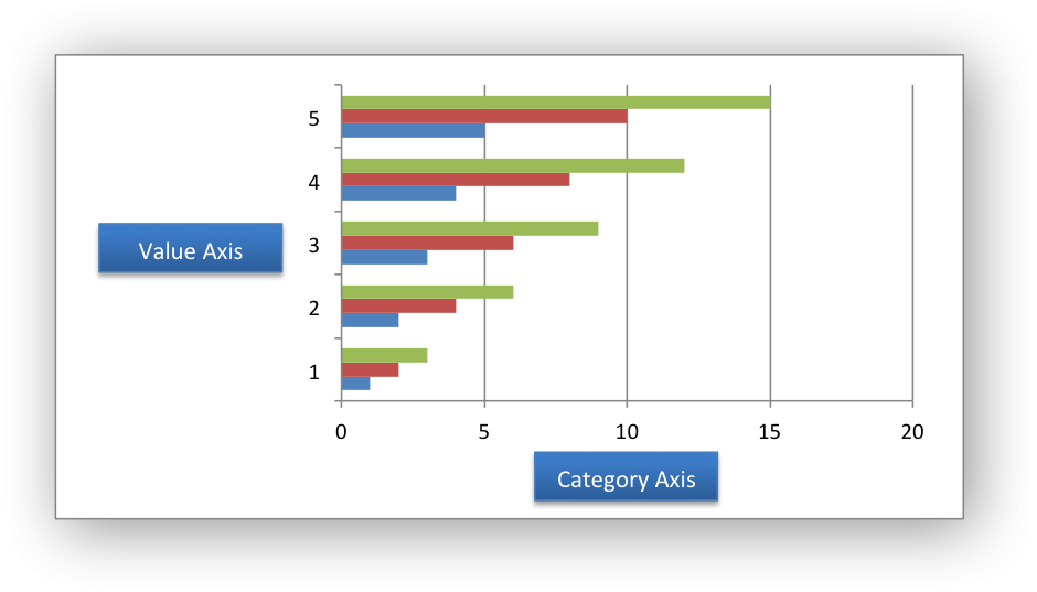
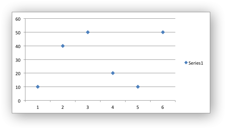
Chart Value and Category Axes#
When working with charts it is important to understand how Excel differentiates between a chart axis that is used for series categories and a chart axis that is used for series values.
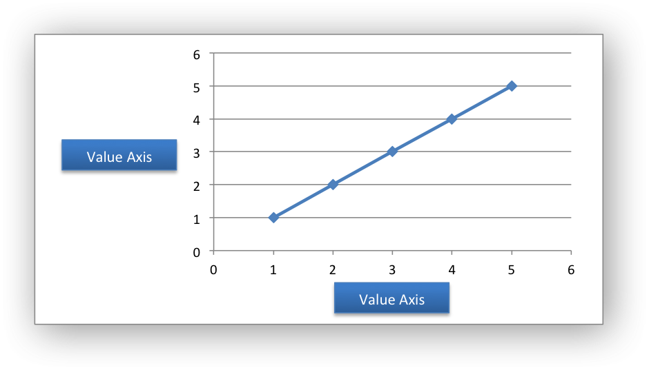
In the majority of Excel charts the X axis is the category axis and each of the values is evenly spaced and sequential. The Y axis is the value axis and points are displayed according to their value:
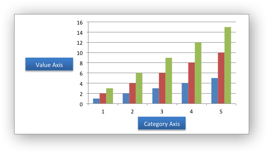
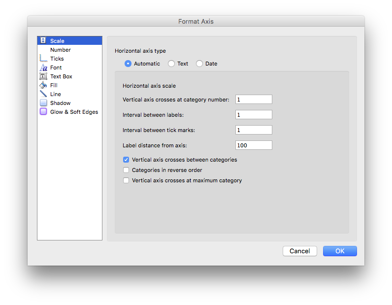
Excel treats these two types of axis differently and exposes different properties for each. For example, here are the properties for a category axis:
Here are properties for a value axis:
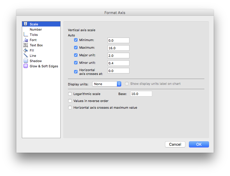
As such, some of the XlsxWriter axis properties can be set for a value
axis, some can be set for a category axis and some properties can be set for
both. For example reverse can be set for either category or value axes while the
min and max properties can only be set for value axes (and Date Axes).
The documentation calls out the type of axis to which properties apply.
For a Bar chart the Category and Value axes are reversed:
A Scatter chart (but not a Line chart) has 2 value axes:
Date Category Axes are a special type of category axis that give them
some of the properties of values axes such as min and max when used
with date or time values.
Chart Series Options#
This following sections detail the more complex options of the
add_series() Chart method:
marker
trendline
y_error_bars
x_error_bars
data_labels
points
smooth
Chart series option: Marker#
The marker format specifies the properties of the markers used to distinguish series on a chart. In general only Line and Scatter chart types and trendlines use markers.
The following properties can be set for marker formats in a chart:
type
size
border
fill
pattern
gradient
The type property sets the type of marker that is used with a series:
chart.add_series({
    'values': '=Sheet1!$A$1:$A$6',
    'marker': {'type': 'diamond'},
})
The following type properties can be set for marker formats in a chart.
These are shown in the same order as in the Excel format dialog:
automatic
none
square
diamond
triangle
x
star
short_dash
long_dash
circle
plus
The automatic type is a special case which turns on a marker using the
default marker style for the particular series number:
chart.add_series({
    'values': '=Sheet1!$A$1:$A$6',
    'marker': {'type': 'automatic'},
})
If automatic is on then other marker properties such as size, border or
fill cannot be set.
The size property sets the size of the marker and is generally used in
conjunction with type:
chart.add_series({
    'values': '=Sheet1!$A$1:$A$6',
    'marker': {'type': 'diamond', 'size': 7},
})
Nested border and fill properties can also be set for a marker:
chart.add_series({
    'values': '=Sheet1!$A$1:$A$6',
    'marker': {
        'type': 'square',
        'size': 8,
        'border': {'color': 'black'},
        'fill':   {'color': 'red'},
    },
})
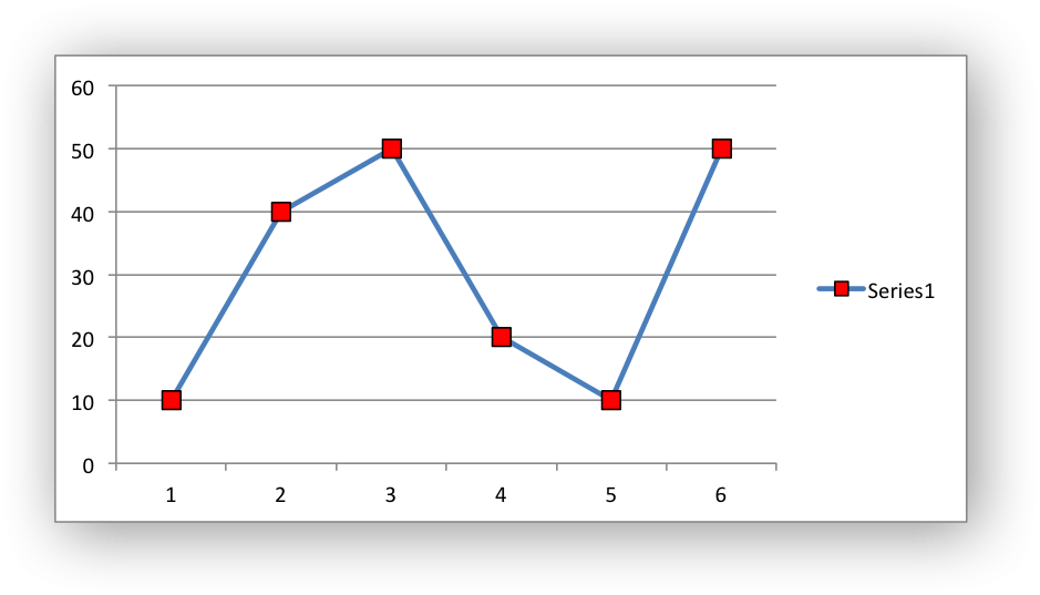
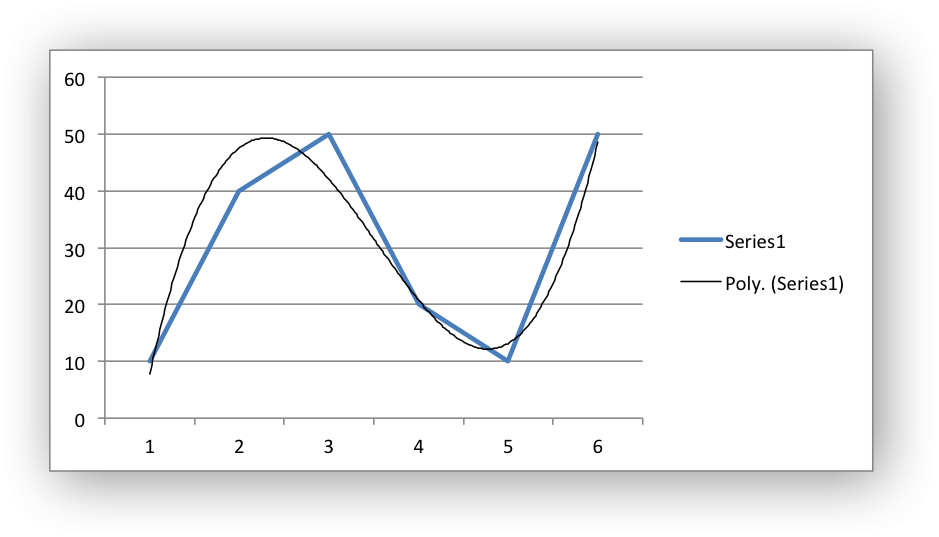
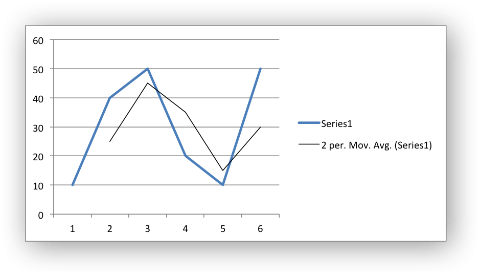
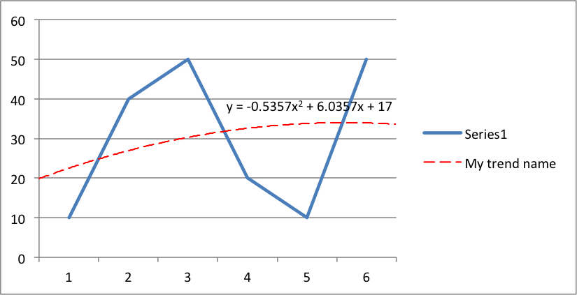
Chart series option: Trendline#
A trendline can be added to a chart series to indicate trends in the data such as a moving average or a polynomial fit.
The following properties can be set for trendlines in a chart series:
type
order               (for polynomial trends)
period              (for moving average)
forward             (for all except moving average)
backward            (for all except moving average)
name
line
intercept           (for exponential, linear and polynomial only)
display_equation    (for all except moving average)
display_r_squared   (for all except moving average)
The type property sets the type of trendline in the series:
chart.add_series({
    'values':    '=Sheet1!$A$1:$A$6',
    'trendline': {'type': 'linear'},
})
The available trendline types are:
exponential
linear
log
moving_average
polynomial
power
A polynomial trendline can also specify the order of the polynomial.
The default value is 2:
chart.add_series({
    'values': '=Sheet1!$A$1:$A$6',
    'trendline': {
        'type': 'polynomial',
        'order': 3,
    },
})
A moving_average trendline can also specify the period of the moving
average. The default value is 2:
chart.add_series({
    'values': '=Sheet1!$A$1:$A$6',
    'trendline': {
        'type': 'moving_average',
        'period': 2,
    },
})
The forward and backward properties set the forecast period of the
trendline:
chart.add_series({
    'values': '=Sheet1!$A$1:$A$6',
    'trendline': {
        'type': 'polynomial',
        'order': 2,
        'forward': 0.5,
        'backward': 0.5,
    },
})
The name property sets an optional name for the trendline that will appear
in the chart legend. If it isn’t specified the Excel default name will be
displayed. This is usually a combination of the trendline type and the series
name:
chart.add_series({
    'values': '=Sheet1!$A$1:$A$6',
    'trendline': {
        'type': 'polynomial',
        'name': 'My trend name',
        'order': 2,
    },
})
The intercept property sets the point where the trendline crosses the Y
(value) axis:
chart.add_series({
    'values': '=Sheet1!$B$1:$B$6',
    'trendline': {'type': 'linear',
                  'intercept': 0.8,
    },
})
The display_equation property displays the trendline equation on the
chart:
chart.add_series({
    'values': '=Sheet1!$B$1:$B$6',
    'trendline': {'type': 'linear',
                  'display_equation': True,
    },
})
The display_r_squared property displays the R squared value of the
trendline on the chart:
chart.add_series({
    'values': '=Sheet1!$B$1:$B$6',
    'trendline': {'type': 'linear',
                  'display_r_squared': True,
    },
})
Several of these properties can be set in one go:
chart.add_series({
    'values': '=Sheet1!$A$1:$A$6',
    'trendline': {
        'type': 'polynomial',
        'name': 'My trend name',
        'order': 2,
        'forward': 0.5,
        'backward': 0.5,
        'display_equation': True,
        'line': {
            'color': 'red',
            'width': 1,
            'dash_type': 'long_dash',
        },
    },
})
Trendlines cannot be added to series in a stacked chart or pie chart, doughnut chart, radar chart or (when implemented) to 3D or surface charts.
Chart series option: Error Bars#
Error bars can be added to a chart series to indicate error bounds in the data.
The error bars can be vertical y_error_bars (the most common type) or
horizontal x_error_bars (for Bar and Scatter charts only).
The following properties can be set for error bars in a chart series:
type
value        (for all types except standard error and custom)
plus_values  (for custom only)
minus_values (for custom only)
direction
end_style
line
The type property sets the type of error bars in the series:
chart.add_series({
    'values':       '=Sheet1!$A$1:$A$6',
    'y_error_bars': {'type': 'standard_error'},
})
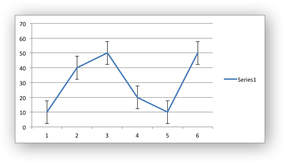
The available error bars types are available:
fixed
percentage
standard_deviation
standard_error
custom
All error bar types, except for standard_error and custom must also
have a value associated with it for the error bounds:
chart.add_series({
    'values': '=Sheet1!$A$1:$A$6',
    'y_error_bars': {
        'type': 'percentage',
        'value': 5,
    },
})
The custom error bar type must specify plus_values and minus_values
which should either by a Sheet1!$A$1:$A$6 type range formula or a list of
values:
chart.add_series({
    'categories': '=Sheet1!$A$1:$A$6',
    'values':     '=Sheet1!$B$1:$B$6',
    'y_error_bars': {
        'type':         'custom',
        'plus_values':  '=Sheet1!$C$1:$C$6',
        'minus_values': '=Sheet1!$D$1:$D$6',
    },
})

# or

chart.add_series({
    'categories': '=Sheet1!$A$1:$A$6',
    'values':     '=Sheet1!$B$1:$B$6',
    'y_error_bars': {
        'type':         'custom',
        'plus_values':  [1, 1, 1, 1, 1],
        'minus_values': [2, 2, 2, 2, 2],
    },
})
Note, as in Excel the items in the minus_values do not need to be negative.
The direction property sets the direction of the error bars. It should be
one of the following:
plus   # Positive direction only.
minus  # Negative direction only.
both   # Plus and minus directions, The default.
The end_style property sets the style of the error bar end cap. The options
are 1 (the default) or 0 (for no end cap):
chart.add_series({
    'values': '=Sheet1!$A$1:$A$6',
    'y_error_bars': {
        'type': 'fixed',
        'value': 2,
        'end_style': 0,
        'direction': 'minus'
    },
})
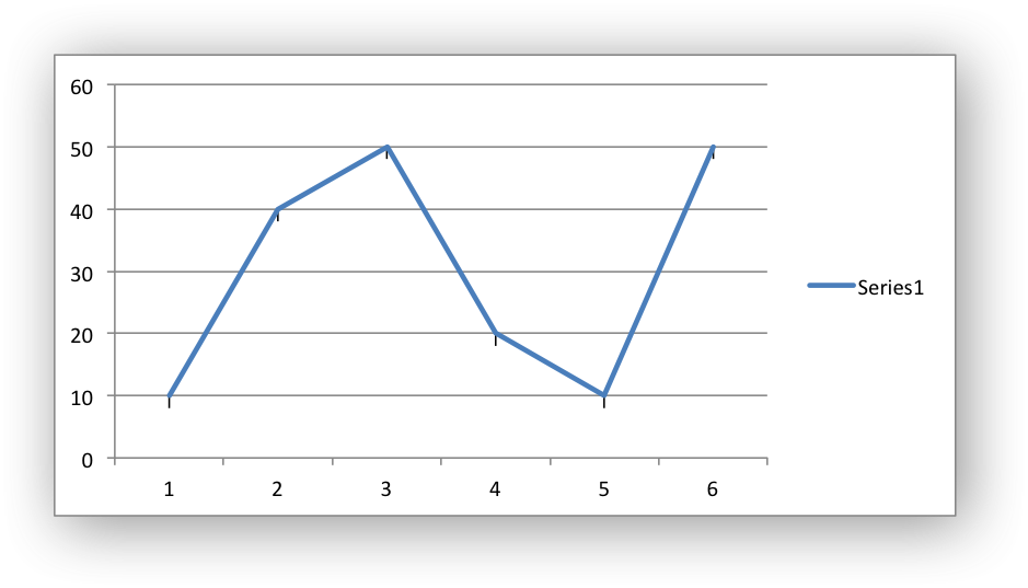
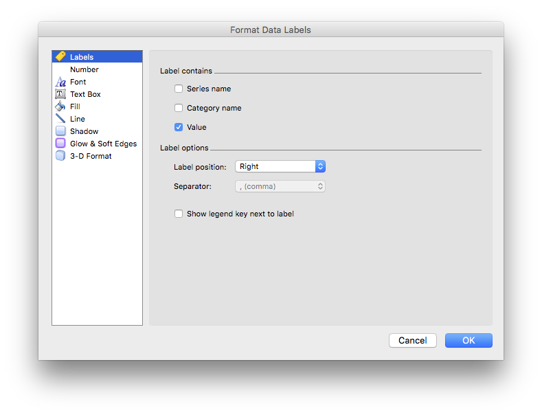
Chart series option: Data Labels#
Data labels can be added to a chart series to indicate the values of the plotted data points.
The following properties can be set for data_labels formats in a chart:
value
category
series_name
position
leader_lines
percentage
separator
legend_key
num_format
font
border
fill
pattern
gradient
custom
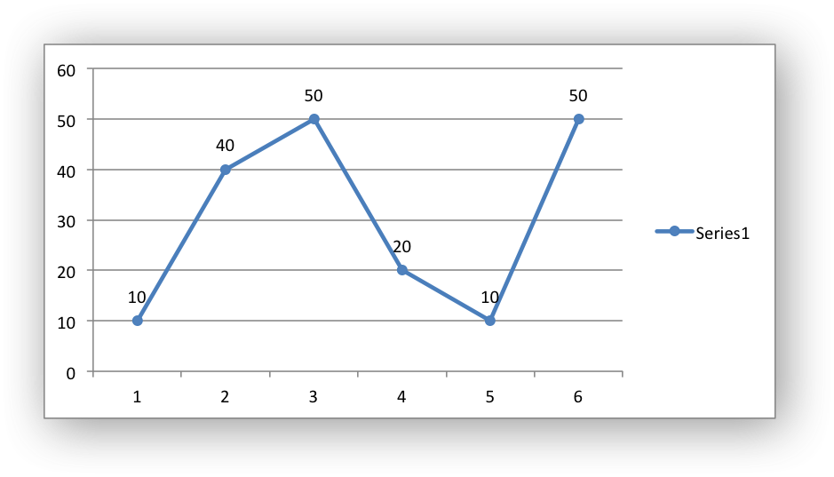
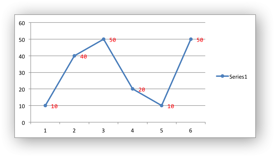
The value property turns on the Value data label for a series:
chart.add_series({
    'values':      '=Sheet1!$A$1:$A$6',
    'data_labels': {'value': True},
})

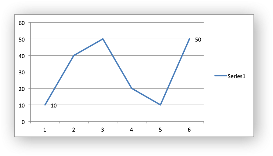
By default data labels are displayed in Excel with only the values shown. However, it is possible to configure other display options, as shown below.
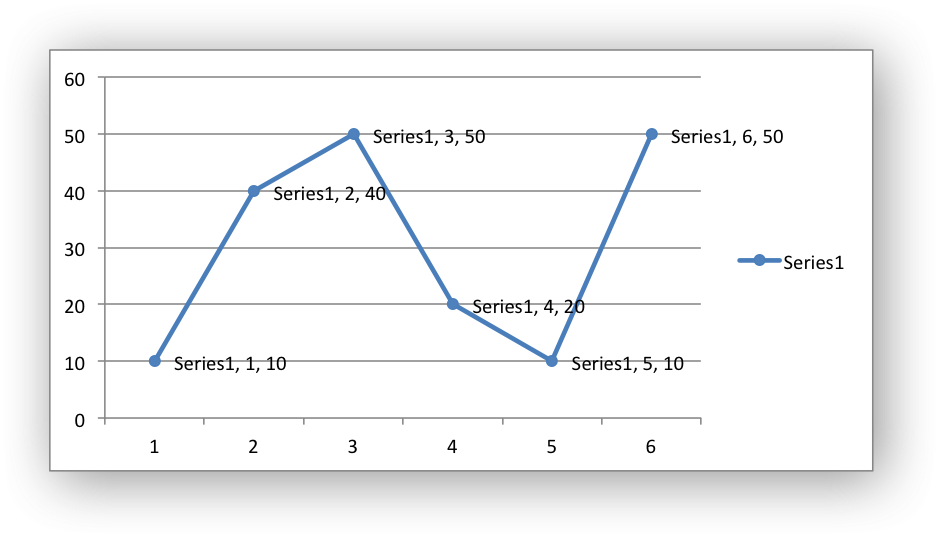
The category property turns on the Category Name data label for a series:
chart.add_series({
    'values':      '=Sheet1!$A$1:$A$6',
    'data_labels': {'category': True},
})
The series_name property turns on the Series Name data label for a
series:
chart.add_series({
    'values':      '=Sheet1!$A$1:$A$6',
    'data_labels': {'series_name': True},
})
Here is an example with all three data label types shown:
The position property is used to position the data label for a series,
relative to the data point:
chart.add_series({
    'values':      '=Sheet1!$A$1:$A$6',
    'data_labels': {'series_name': True, 'position': 'above'},
})
In Excel the allowable data label positions vary for different chart types. The allowable positions are:
Position |
Line, Scatter, Stock |
Bar, Column |
Pie, Doughnut |
Area, Radar |
|---|---|---|---|---|
center |
Yes |
Yes |
Yes |
Yes* |
right |
Yes* |
|||
left |
Yes |
|||
above |
Yes |
|||
below |
Yes |
|||
inside_base |
Yes |
|||
inside_end |
Yes |
Yes |
||
outside_end |
Yes* |
Yes |
||
best_fit |
Yes* |
Note: The * indicates the default position for each chart type in Excel, if a position isn’t specified by the user.
The percentage property is used to turn on the display of data labels as a
Percentage for a series. In Excel the percentage data label option is
only available for Pie and Doughnut chart variants:
chart.add_series({
    'values':      '=Sheet1!$A$1:$A$6',
    'data_labels': {'percentage': True},
})
The leader_lines property is used to turn on Leader Lines for the data
label of a series:
chart.add_series({
    'values':      '=Sheet1!$A$1:$A$6',
    'data_labels': {'value': True, 'leader_lines': True},
})
Note
Even when leader lines are turned on they aren’t automatically visible in Excel or XlsxWriter. Due to an Excel limitation (or design) leader lines only appear if the data label is moved manually or if the data labels are very close and need to be adjusted automatically.
The separator property is used to change the separator between multiple
data label items:
chart.add_series({
    'values':      '=Sheet1!$A$1:$A$6',
    'data_labels': {'value': True, 'category': True,
                    'series_name': True, 'separator': "\n"},
})
The separator value must be one of the following strings:
','
';'
'.'
'\n'
' '
The legend_key property is used to turn on the Legend Key for the data
label of a series:
chart.add_series({
    'values':      '=Sheet1!$A$1:$A$6',
    'data_labels': {'value': True, 'legend_key': True},
})
The num_format property is used to set the number format for the data
labels of a series:
chart.add_series({
    'values':      '=Sheet1!$A$1:$A$6',
    'data_labels': {'value': True, 'num_format': '#,##0.00'},
})
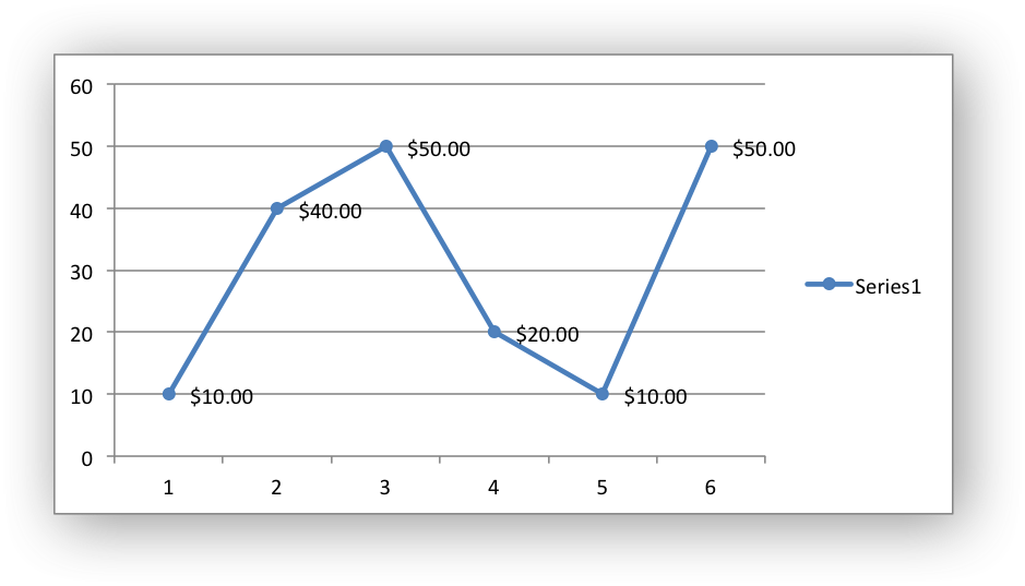
The number format is similar to the Worksheet Cell Format num_format
apart from the fact that a format index cannot be used. An explicit format
string must be used as shown above. See set_num_format() for more
information.
The font property is used to set the font of the data labels of a series:
chart.add_series({
    'values': '=Sheet1!$A$1:$A$6',
    'data_labels': {
        'value': True,
        'font': {'name': 'Consolas', 'color': 'red'}
    },
})
The font property is also used to rotate the data labels of a series:
chart.add_series({

    'values': '=Sheet1!$A$1:$A$6',
    'data_labels': {
        'value': True,
        'font': {'rotation': 45}
    },
})
See Chart Fonts.
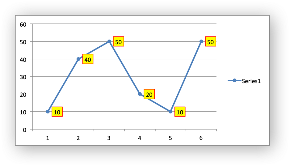
Standard chart formatting such as border and fill can also be added to
the data labels:
chart.add_series({
    'values':     '=Sheet1!$A$1:$A$6',
    'data_labels': {'value': True,
                    'border': {'color': 'red'},
                    'fill':   {'color': 'yellow'}},
})
The custom property is used to set properties for individual data
labels. This is explained in detail in the next section.
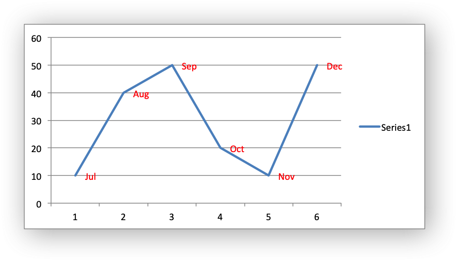
Chart series option: Custom Data Labels#
The custom data label property is used to set the properties of individual
data labels in a series. The most common use for this is to set custom text or
number labels:
custom_labels = [
    {'value': 'Jan'},
    {'value': 'Feb'},
    {'value': 'Mar'},
    {'value': 'Apr'},
    {'value': 'May'},
    {'value': 'Jun'},
]

chart.add_series({
    'values': '=Sheet1!$A$1:$A$6',
    'data_labels': {'value': True, 'custom': custom_labels},
})

As shown in the previous examples th custom property should be a list of
dicts. Any property dict that is set to None or not included in the list
will be assigned the default data label value:
custom_labels = [
    None,
    {'value': 'Feb'},
    {'value': 'Mar'},
    {'value': 'Apr'},
]

chart.add_series({
    'values': '=Sheet1!$A$1:$A$6',
    'data_labels': {'value': True, 'custom': custom_labels},
})

The property elements of the custom lists should be dicts with the
following allowable keys/sub-properties:
value
font
position
delete
The value property should be a string, number or formula string that refers to
a cell from which the value will be taken:
custom_labels = [
    {'value': '=Sheet1!$C$1'},
    {'value': '=Sheet1!$C$2'},
    {'value': '=Sheet1!$C$3'},
    {'value': '=Sheet1!$C$4'},
    {'value': '=Sheet1!$C$5'},
    {'value': '=Sheet1!$C$6'},
]
The font property is used to set the font of the custom data label of a series:
custom_labels = [
    {'value': '=Sheet1!$C$1', 'font': {'color': 'red'}},
    {'value': '=Sheet1!$C$2', 'font': {'color': 'red'}},
    {'value': '=Sheet1!$C$3', 'font': {'color': 'red'}},
    {'value': '=Sheet1!$C$4', 'font': {'color': 'red'}},
    {'value': '=Sheet1!$C$5', 'font': {'color': 'red'}},
    {'value': '=Sheet1!$C$6', 'font': {'color': 'red'}},
]

chart.add_series({
    'values': '=Sheet1!$A$1:$A$6',
    'data_labels': {'value': True, 'custom': custom_labels},
})
See Chart Fonts for details on the available font properties.
The position property is used to position the custom data label, such as
“center” or “right”. See the position property for series data labels above.
The delete property can be used to delete labels in a series. This can be
useful if you want to highlight one or more cells in the series, for example
the maximum and the minimum:
custom_labels = [
    None,
    {'delete': True},
    {'delete': True},
    {'delete': True},
    {'delete': True},
    None,
]

chart.add_series({
    'values': '=Sheet1!$A$1:$A$6',
    'data_labels': {'value': True, 'custom': custom_labels},
})
Standard chart formatting such as border and fill can also be added to
the custom data labels:
custom_labels = [
    {'value': 'Jan', 'border': {'color': 'blue'}},
    {'value': 'Feb'},
    {'value': 'Mar'},
    {'value': 'Apr'},
    {'value': 'May'},
    {'value': 'Jun', 'fill':   {'color': 'green'}},
]

chart.add_series({
    'values':     '=Sheet1!$A$1:$A$6',
    'marker': {'type': 'circle'},
    'data_labels': {'value': True,
                    'custom': custom_labels,
                    'border': {'color': 'red'},
                    'fill':   {'color': 'yellow'}},
})
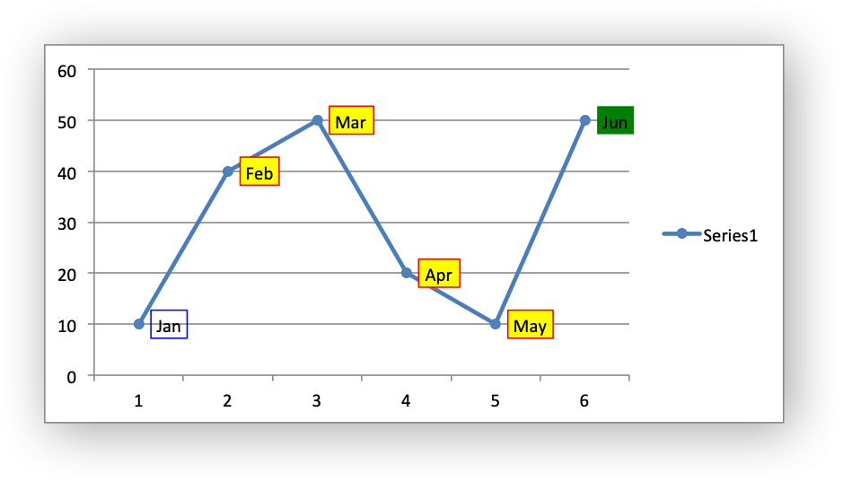
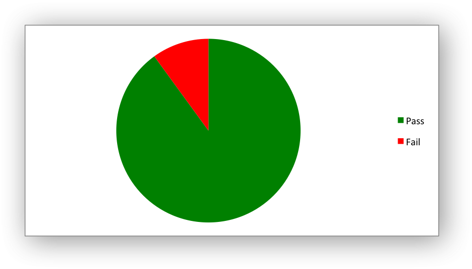
Chart series option: Points#
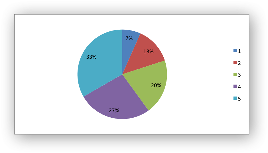
In general formatting is applied to an entire series in a chart. However, it is occasionally required to format individual points in a series. In particular this is required for Pie/Doughnut charts where each segment is represented by a point.
In these cases it is possible to use the points property of
add_series():
import xlsxwriter

workbook = xlsxwriter.Workbook('chart_pie.xlsx')

worksheet = workbook.add_worksheet()
chart = workbook.add_chart({'type': 'pie'})

data = [
    ['Pass', 'Fail'],
    [90, 10],
]

worksheet.write_column('A1', data[0])
worksheet.write_column('B1', data[1])

chart.add_series({
    'categories': '=Sheet1!$A$1:$A$2',
    'values':     '=Sheet1!$B$1:$B$2',
    'points': [
        {'fill': {'color': 'green'}},
        {'fill': {'color': 'red'}},
    ],
})

worksheet.insert_chart('C3', chart)

workbook.close()
The points property takes a list of format options (see the “Chart
Formatting” section below). To assign default properties to points in a series
pass None values in the array ref:
# Format point 3 of 3 only.
chart.add_series({
    'values': '=Sheet1!A1:A3',
    'points': [
        None,
        None,
        {'fill': {'color': '#990000'}},
    ],
})

# Format point 1 of 3 only.
chart.add_series({
    'values': '=Sheet1!A1:A3',
    'points': [
        {'fill': {'color': '#990000'}},
    ],
})
Chart series option: Smooth#
The smooth option is used to set the smooth property of a line series. It
is only applicable to the line and scatter chart types:
chart.add_series({
    'categories': '=Sheet1!$A$1:$A$6',
    'values':     '=Sheet1!$B$1:$B$6',
    'smooth':     True,
})
Chart Formatting#
The following chart formatting properties can be set for any chart object that they apply to (and that are supported by XlsxWriter) such as chart lines, column fill areas, plot area borders, markers, gridlines and other chart elements:
line
border
fill
pattern
gradient
Chart formatting properties are generally set using dicts:
chart.add_series({
    'values': '=Sheet1!$A$1:$A$6',
    'line':   {'color': 'red'},
})
In some cases the format properties can be nested. For example a marker may
contain border and fill sub-properties:
chart.add_series({
    'values': '=Sheet1!$A$1:$A$6',
    'line':   {'color': 'blue'},
    'marker': {'type': 'square',
               'size': 5,
               'border': {'color': 'red'},
               'fill':   {'color': 'yellow'}
    },
})
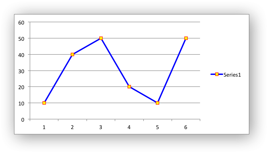
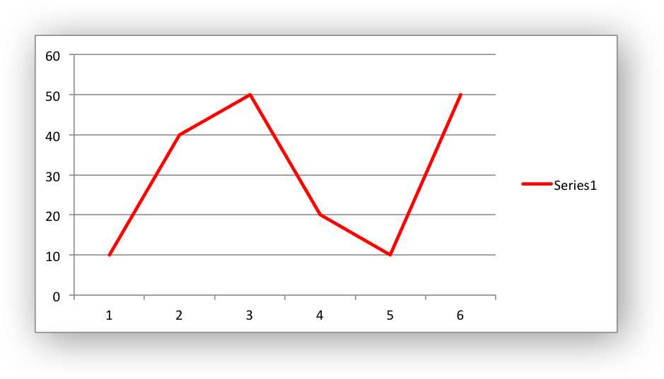
Chart formatting: Line#
The line format is used to specify properties of line objects that appear in a chart such as a plotted line on a chart or a border.
The following properties can be set for line formats in a chart:
none
color
width
dash_type
transparency
The none property is used to turn the line off (it is always on by
default except in Scatter charts). This is useful if you wish to plot a series
with markers but without a line:
chart.add_series({
    'values': '=Sheet1!$A$1:$A$6',
    'line':   {'none': True},
    'marker': {'type': 'automatic'},
})
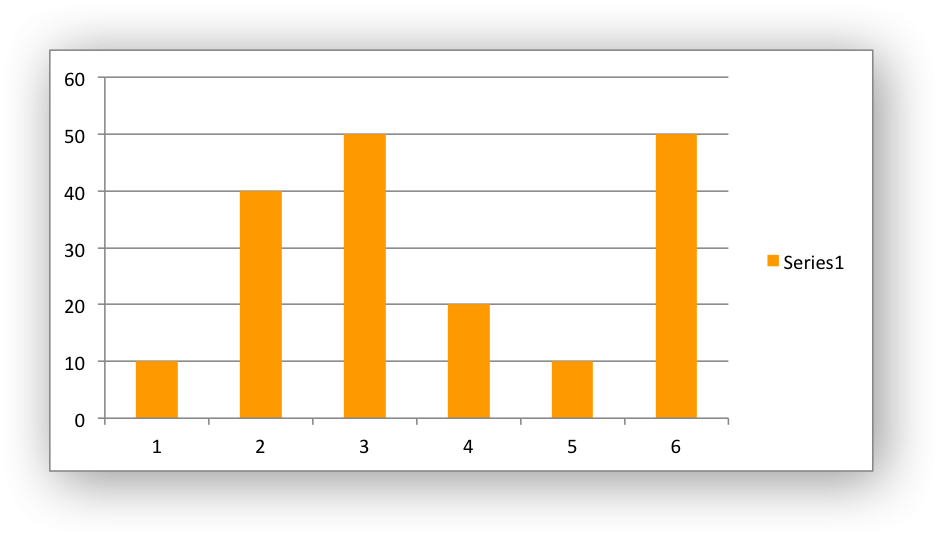
The color property can be a Color() instance, a HTML style
#RRGGBB string or a limited number of named colors, see Working with Colors.
Example:
chart.add_series({
    'values': '=Sheet1!$A$1:$A$6',
    'line':   {'color': '#FF0000'},
})

# Or:

chart.add_series({
    'values': '=Sheet1!$A$1:$A$6',
    'line':   {'color': Color('#FF9900')},
})
The width property sets the width of the line. It should be specified
in increments of 0.25 of a point as in Excel:
chart.add_series({
    'values': '=Sheet1!$A$1:$A$6',
    'line':   {'width': 3.25},
})
The dash_type property sets the dash style of the line:
chart.add_series({
    'values': '=Sheet1!$A$1:$A$6',
    'line':   {'dash_type': 'dash_dot'},
})
The following dash_type values are available. They are shown in the order
that they appear in the Excel dialog:
solid
round_dot
square_dot
dash
dash_dot
long_dash
long_dash_dot
long_dash_dot_dot
The default line style is solid.
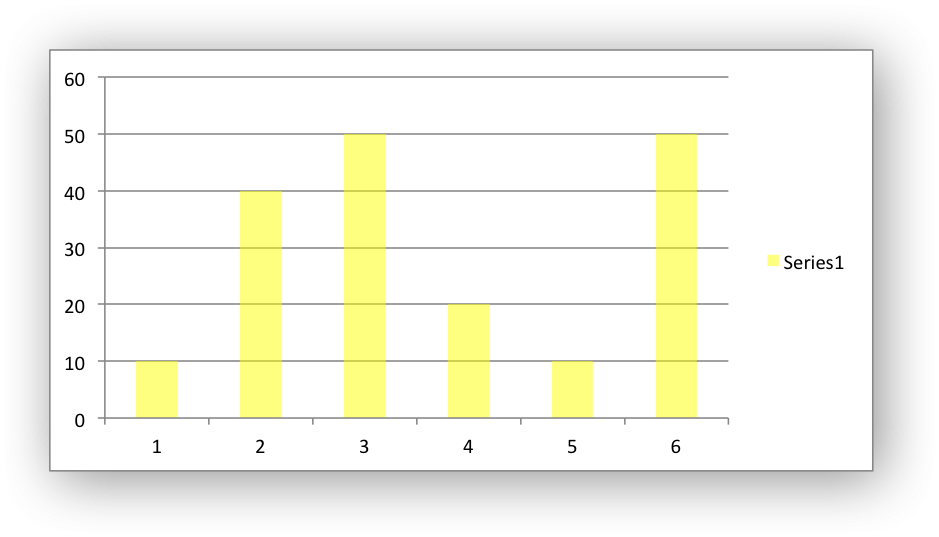
The transparency property sets the transparency of the line color in the
integer range 1 - 100. The color must be set for transparency to work, it
doesn’t work with an automatic/default color:
chart.add_series({
    'values': '=Sheet1!$A$1:$A$6',
    'line':   {'color': 'yellow', 'transparency': 50},
})
More than one line property can be specified at a time:
chart.add_series({
    'values': '=Sheet1!$A$1:$A$6',
     'line': {
         'color': 'red',
         'width': 1.25,
         'dash_type': 'square_dot',
     },
})
Chart formatting: Border#
The border property is a synonym for line.
It can be used as a descriptive substitute for line in chart types such as
Bar and Column that have a border and fill style rather than a line style. In
general chart objects with a border property will also have a fill
property.
Chart formatting: Solid Fill#
The solid fill format is used to specify filled areas of chart objects such as the interior of a column or the background of the chart itself.
The following properties can be set for fill formats in a chart:
none
color
transparency
The none property is used to turn the fill property off (it is
generally on by default):
chart.add_series({
    'values': '=Sheet1!$A$1:$A$6',
    'fill':   {'none': True},
    'border': {'color': 'black'}
})
The color property sets the color of the fill area:
chart.add_series({
    'values': '=Sheet1!$A$1:$A$6',
    'fill':   {'color': 'red'}
})
The available colors are shown in the main XlsxWriter documentation. It is
also possible to set the color of a fill with a Html style #RRGGBB string
or a limited number of named colors, see Working with Colors:
chart.add_series({
    'values': '=Sheet1!$A$1:$A$6',
    'fill':   {'color': '#FF9900'}
})
The transparency property sets the transparency of the solid fill color in
the integer range 1 - 100. The color must be set for transparency to work, it
doesn’t work with an automatic/default color:
chart.set_chartarea({'fill': {'color': 'yellow', 'transparency': 50}})
The fill format is generally used in conjunction with a border format
which has the same properties as a line format:
chart.add_series({
    'values': '=Sheet1!$A$1:$A$6',
    'fill':   {'color': 'red'},
    'border': {'color': 'black'}
})
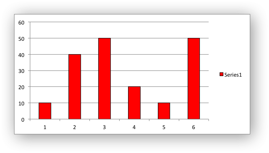
Chart formatting: Pattern Fill#
The pattern fill format is used to specify pattern filled areas of chart objects such as the interior of a column or the background of the chart itself.
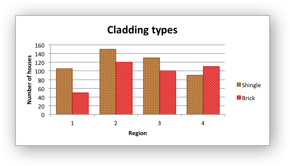
The following properties can be set for pattern fill formats in a chart:
pattern:   the pattern to be applied (required)
fg_color:  the foreground color of the pattern (required)
bg_color:  the background color (optional, defaults to white)
For example:
chart.set_plotarea({
    'pattern': {
        'pattern': 'percent_5',
        'fg_color': 'red',
        'bg_color': 'yellow',
    }
})
The following patterns can be applied:
percent_5percent_10percent_20percent_25percent_30percent_40percent_50percent_60percent_70percent_75percent_80percent_90light_downward_diagonallight_upward_diagonaldark_downward_diagonaldark_upward_diagonalwide_downward_diagonalwide_upward_diagonallight_verticallight_horizontalnarrow_verticalnarrow_horizontaldark_verticaldark_horizontaldashed_downward_diagonaldashed_upward_diagonaldashed_horizontaldashed_verticalsmall_confettilarge_confettizigzagwavediagonal_brickhorizontal_brickweaveplaiddivotdotted_griddotted_diamondshingletrellisspheresmall_gridlarge_gridsmall_checklarge_checkoutlined_diamondsolid_diamond
The foreground color, fg_color, is a required parameter and can be a Html
style #RRGGBB string or a limited number of named colors, see
Working with Colors.
The background color, bg_color, is optional and defaults to white.
If a pattern fill is used on a chart object it overrides the solid fill properties of the object.
Chart formatting: Gradient Fill#
The gradient fill format is used to specify gradient filled areas of chart objects such as the interior of a column or the background of the chart itself.
The following properties can be set for gradient fill formats in a chart:
colors:    a list of colors
positions: an optional list of positions for the colors
type:      the optional type of gradient fill
angle:     the optional angle of the linear fill
The colors property sets a list of colors that define the gradient:
chart.set_plotarea({
    'gradient': {'colors': ['#FFEFD1', '#F0EBD5', '#B69F66']}
})
Excel allows between 2 and 10 colors in a gradient but it is unlikely that you will require more than 2 or 3.
As with solid or pattern fill it is also possible to set the colors of a
gradient with a Html style #RRGGBB string or a limited number of named
colors, see Working with Colors:
chart.add_series({
    'values':   '=Sheet1!$A$1:$A$6',
    'gradient': {'colors': ['red', 'green']}
})
The positions defines an optional list of positions, between 0 and 100, of
where the colors in the gradient are located. Default values are provided for
colors lists of between 2 and 4 but they can be specified if required:
chart.add_series({
    'values': '=Sheet1!$A$1:$A$6',
    'gradient': {
        'colors':    ['#DDEBCF', '#156B13'],
        'positions': [10,        90],
    }
})
The type property can have one of the following values:
linear        (the default)
radial
rectangular
path
For example:
chart.add_series({
    'values': '=Sheet1!$A$1:$A$6',
    'gradient': {
        'colors': ['#DDEBCF', '#9CB86E', '#156B13'],
        'type': 'radial'
    }
})
If type isn’t specified it defaults to linear.
For a linear fill the angle of the gradient can also be specified:
chart.add_series({
    'values': '=Sheet1!$A$1:$A$6',
    'gradient': {'colors': ['#DDEBCF', '#9CB86E', '#156B13'],
                 'angle': 45}
})
The default angle is 90 degrees.
If gradient fill is used on a chart object it overrides the solid fill and pattern fill properties of the object.
Chart Fonts#
The following font properties can be set for any chart object that they apply to (and that are supported by XlsxWriter) such as chart titles, axis labels, axis numbering and data labels:
name
size
bold
italic
underline
rotation
color
These properties correspond to the equivalent Worksheet cell Format object properties. See the The Format Class section for more details about Format properties and how to set them.
The following explains the available font properties:
name: Set the font name:chart.set_x_axis({'num_font': {'name': 'Arial'}})
size: Set the font size:chart.set_x_axis({'num_font': {'name': 'Arial', 'size': 9}})
bold: Set the font bold property:chart.set_x_axis({'num_font': {'bold': True}})
italic: Set the font italic property:chart.set_x_axis({'num_font': {'italic': True}})
underline: Set the font underline property:chart.set_x_axis({'num_font': {'underline': True}})
rotation: Set the font rotation, angle, property in the integer range -90 to 90 deg, and 270-271 deg:chart.set_x_axis({'num_font': {'rotation': 45}})
The font rotation angle is useful for displaying axis data such as dates in a more compact format.
There are 2 special case angles outside the range -90 to 90:
270: Stacked text, where the text runs from top to bottom.
271: A special variant of stacked text for East Asian fonts.
color: Set the font color property. Can be a color index, a color name or HTML style RGB color:chart.set_x_axis({'num_font': {'color': 'red' }}) chart.set_y_axis({'num_font': {'color': '#92D050'}})
Here is an example of Font formatting in a Chart program:
chart.set_title({
    'name': 'Test Results',
    'name_font': {
        'name': 'Calibri',
        'color': 'blue',
    },
})

chart.set_x_axis({
    'name': 'Month',
    'name_font': {
        'name': 'Courier New',
        'color': '#92D050'
    },
    'num_font': {
        'name': 'Arial',
        'color': '#00B0F0',
    },
})

chart.set_y_axis({
    'name': 'Units',
    'name_font': {
        'name': 'Century',
        'color': 'red'
    },
    'num_font': {
        'bold': True,
        'italic': True,
        'underline': True,
        'color': '#7030A0',
    },
})

chart.set_legend({'font': {'bold': 1, 'italic': 1}})
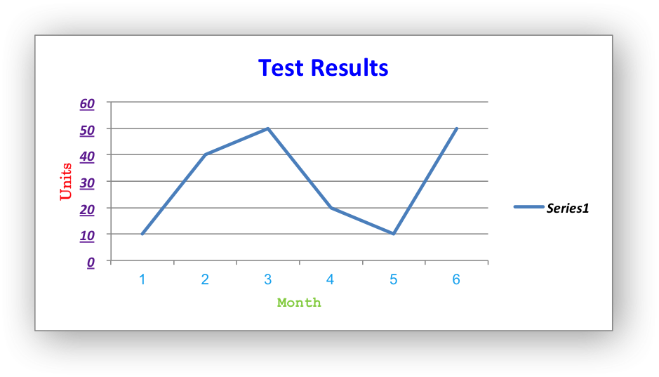
Chart Layout#
The position of the chart in the worksheet is controlled by the
set_size() method.
It is also possible to change the layout of the following chart sub-objects:
plotarea
legend
title
x_axis caption
y_axis caption
Here are some examples:
chart.set_plotarea({
    'layout': {
        'x':      0.13,
        'y':      0.26,
        'width':  0.73,
        'height': 0.57,
    }
})

chart.set_legend({
    'layout': {
        'x':      0.80,
        'y':      0.37,
        'width':  0.12,
        'height': 0.25,
    }
})

chart.set_title({
    'name':    'Title',
    'overlay': True,
    'layout': {
        'x': 0.42,
        'y': 0.14,
    }
})

chart.set_x_axis({
    'name': 'X axis',
    'name_layout': {
        'x': 0.34,
        'y': 0.85,
    }
})
See set_plotarea(), set_legend(), set_title() and
set_x_axis(),
Note
It is only possible to change the width and height for the plotarea
and legend objects. For the other text based objects the width and
height are changed by the font dimensions.
The layout units must be a float in the range 0 < x <= 1 and are expressed
as a percentage of the chart dimensions as shown below:
From this the layout units are calculated as follows:
layout:
    x      = a / W
    y      = b / H
    width  = w / W
    height = h / H
These units are cumbersome and can vary depending on other elements in the chart such as text lengths. However, these are the units that are required by Excel to allow relative positioning. Some trial and error is generally required.
Note
The plotarea origin is the top left corner in the plotarea itself and
does not take into account the axes.
Date Category Axes#
Date Category Axes are category axes that display time or date information. In
XlsxWriter Date Category Axes are set using the date_axis option in
set_x_axis() or set_y_axis():
chart.set_x_axis({'date_axis': True})
In general you should also specify a number format for a date axis although Excel will usually default to the same format as the data being plotted:
chart.set_x_axis({
    'date_axis':  True,
    'num_format': 'dd/mm/yyyy',
})
Excel doesn’t normally allow minimum and maximum values to be set for category
axes. However, date axes are an exception. The min and max values
should be set as Excel times or dates:
chart.set_x_axis({
    'date_axis': True,
    'min': date(2013, 1, 2),
    'max': date(2013, 1, 9),
    'num_format': 'dd/mm/yyyy',
})
For date axes it is also possible to set the type of the major and minor units:
chart.set_x_axis({
    'date_axis':       True,
    'minor_unit':      4,
    'minor_unit_type': 'months',
    'major_unit':      1,
    'major_unit_type': 'years',
    'num_format':      'dd/mm/yyyy',
})
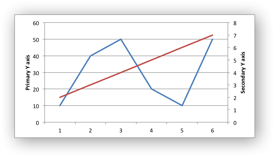
Chart Secondary Axes#
It is possible to add a secondary axis of the same type to a chart by setting
the y2_axis or x2_axis property of the series:
import xlsxwriter

workbook = xlsxwriter.Workbook('chart_secondary_axis.xlsx')
worksheet = workbook.add_worksheet()

data = [
    [2, 3, 4, 5, 6, 7],
    [10, 40, 50, 20, 10, 50],
]

worksheet.write_column('A2', data[0])
worksheet.write_column('B2', data[1])

chart = workbook.add_chart({'type': 'line'})

# Configure a series with a secondary axis.
chart.add_series({
    'values': '=Sheet1!$A$2:$A$7',
    'y2_axis': True,
})

# Configure a primary (default) Axis.
chart.add_series({
    'values': '=Sheet1!$B$2:$B$7',
})

chart.set_legend({'position': 'none'})

chart.set_y_axis({'name': 'Primary Y axis'})
chart.set_y2_axis({'name': 'Secondary Y axis'})

worksheet.insert_chart('D2', chart)

workbook.close()
It is also possible to have a secondary, combined, chart either with a shared or secondary axis, see below.
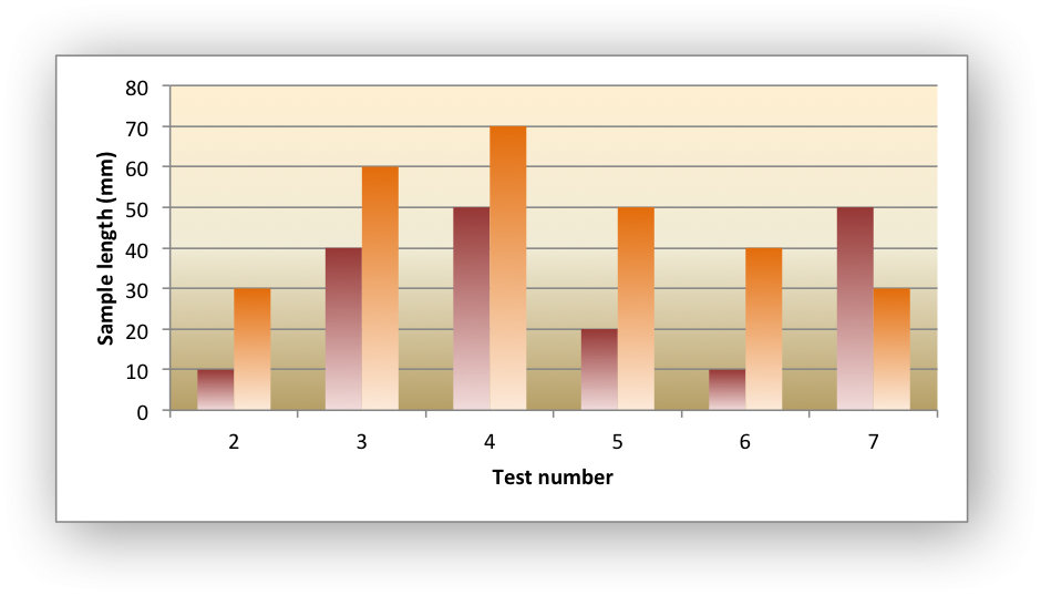
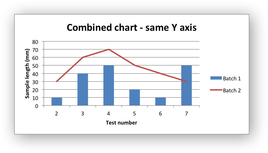
Combined Charts#
It is also possible to combine two different chart types, for example a column
and line chart to create a Pareto chart using the Chart combine()
method:
The combined charts can share the same Y axis like the following example:
# Usual setup to create workbook and add data...

# Create a new column chart. This will use this as the primary chart.
column_chart = workbook.add_chart({'type': 'column'})

# Configure the data series for the primary chart.
column_chart.add_series({
    'name':       '=Sheet1!B1',
    'categories': '=Sheet1!A2:A7',
    'values':     '=Sheet1!B2:B7',
})

# Create a new column chart. This will use this as the secondary chart.
line_chart = workbook.add_chart({'type': 'line'})

# Configure the data series for the secondary chart.
line_chart.add_series({
    'name':       '=Sheet1!C1',
    'categories': '=Sheet1!A2:A7',
    'values':     '=Sheet1!C2:C7',
})

# Combine the charts.
column_chart.combine(line_chart)

# Add a chart title and some axis labels. Note, this is done via the
# primary chart.
column_chart.set_title({ 'name': 'Combined chart - same Y axis'})
column_chart.set_x_axis({'name': 'Test number'})
column_chart.set_y_axis({'name': 'Sample length (mm)'})

# Insert the chart into the worksheet
worksheet.insert_chart('E2', column_chart)
The secondary chart can also be placed on a secondary axis using the methods shown in the previous section.
In this case it is just necessary to add a y2_axis parameter to the series
and, if required, add a title using set_y2_axis(). The following are
the additions to the previous example to place the secondary chart on the
secondary axis:
# ...
line_chart.add_series({
    'name':       '=Sheet1!C1',
    'categories': '=Sheet1!A2:A7',
    'values':     '=Sheet1!C2:C7',
    'y2_axis':    True,
})

# Add a chart title and some axis labels.
# ...
column_chart.set_y2_axis({'name': 'Target length (mm)'})

The examples above use the concept of a primary and secondary chart. The primary chart is the chart that defines the primary X and Y axis. It is also used for setting all chart properties apart from the secondary data series. For example the chart title and axes properties should be set via the primary chart.
See also Example: Combined Chart and Example: Pareto Chart for more detailed examples.
There are some limitations on combined charts:
Only two charts can be combined.
Pie charts cannot currently be combined.
Scatter charts cannot currently be used as a primary chart but they can be used as a secondary chart.
Bar charts can only combine secondary charts on a secondary axis. This is an Excel limitation.
Chartsheets#
The examples shown above and in general the most common type of charts in Excel are embedded charts.
However, it is also possible to create “Chartsheets” which are worksheets that are comprised of a single chart:
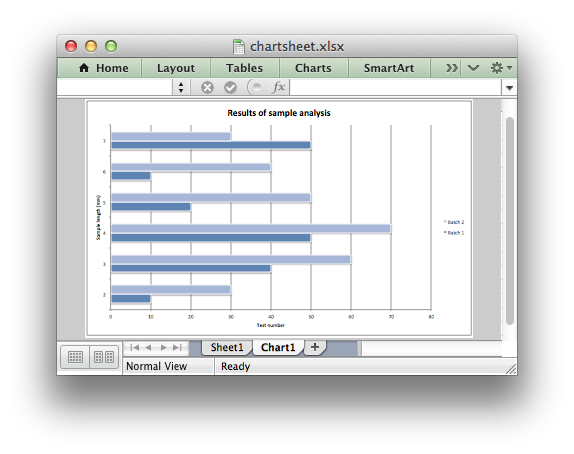
See The Chartsheet Class for details.
Charts from Worksheet Tables#
Charts can by created from Worksheet Tables. However, Excel
has a limitation where the data series name, if specified, must refer to a
cell within the table (usually one of the headers).
To workaround this Excel limitation you can specify a user defined name in the table and refer to that from the chart:
import xlsxwriter

workbook = xlsxwriter.Workbook('chart_pie.xlsx')

worksheet = workbook.add_worksheet()

data = [
    ['Apple',  60],
    ['Cherry', 30],
    ['Pecan',  10],
]

worksheet.add_table('A1:B4', {'data': data,
                              'columns': [{'header': 'Types'},
                                         {'header': 'Number'}]}
)

chart = workbook.add_chart({'type': 'pie'})

chart.add_series({
    'name':       '=Sheet1!$A$1',
    'categories': '=Sheet1!$A$2:$A$4',
    'values':     '=Sheet1!$B$2:$B$4',
})

worksheet.insert_chart('D2', chart)

workbook.close()
Chart Limitations#
The following chart features aren’t supported in XlsxWriter:
3D charts and controls.
Bubble, Surface or other chart types not listed in The Chart Class.
Chart Examples#
See Chart Examples.