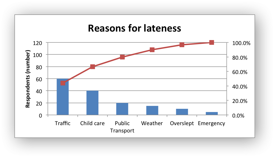
Example: Pareto Chart#
Example of creating a Pareto chart with a secondary chart and axis.
#######################################################################
#
# An example of creating of a Pareto chart with Python and XlsxWriter.
#
# SPDX-License-Identifier: BSD-2-Clause
#
# Copyright (c) 2013-2025, John McNamara, jmcnamara@cpan.org
#
import xlsxwriter

workbook = xlsxwriter.Workbook("chart_pareto.xlsx")
worksheet = workbook.add_worksheet()

# Formats used in the workbook.
bold = workbook.add_format({"bold": True})
percent_format = workbook.add_format({"num_format": "0.0%"})

# Widen the columns for visibility.
worksheet.set_column("A:A", 15)
worksheet.set_column("B:C", 10)

# Add the worksheet data that the charts will refer to.
headings = ["Reason", "Number", "Percentage"]

reasons = [
    "Traffic",
    "Child care",
    "Public Transport",
    "Weather",
    "Overslept",
    "Emergency",
]

numbers = [60, 40, 20, 15, 10, 5]
percents = [0.44, 0.667, 0.8, 0.9, 0.967, 1]

worksheet.write_row("A1", headings, bold)
worksheet.write_column("A2", reasons)
worksheet.write_column("B2", numbers)
worksheet.write_column("C2", percents, percent_format)


# Create a new column chart. This will be the primary chart.
column_chart = workbook.add_chart({"type": "column"})

# Add a series.
column_chart.add_series(
    {
        "categories": "=Sheet1!$A$2:$A$7",
        "values": "=Sheet1!$B$2:$B$7",
    }
)

# Add a chart title.
column_chart.set_title({"name": "Reasons for lateness"})

# Turn off the chart legend.
column_chart.set_legend({"position": "none"})

# Set the title and scale of the Y axes. Note, the secondary axis is set from
# the primary chart.
column_chart.set_y_axis({"name": "Respondents (number)", "min": 0, "max": 120})
column_chart.set_y2_axis({"max": 1})

# Create a new line chart. This will be the secondary chart.
line_chart = workbook.add_chart({"type": "line"})

# Add a series, on the secondary axis.
line_chart.add_series(
    {
        "categories": "=Sheet1!$A$2:$A$7",
        "values": "=Sheet1!$C$2:$C$7",
        "marker": {"type": "automatic"},
        "y2_axis": 1,
    }
)

# Combine the charts.
column_chart.combine(line_chart)

# Insert the chart into the worksheet.
worksheet.insert_chart("F2", column_chart)

workbook.close()