Example: Combined Chart#
Example of creating combined Excel charts with two chart types.
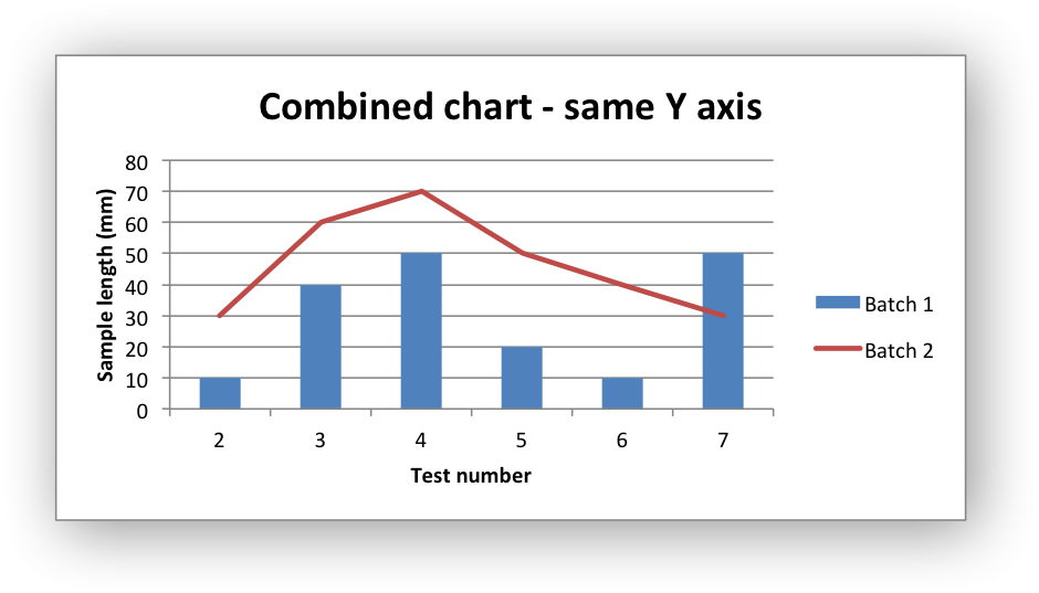
In the first example we create a combined column and line chart that share the same X and Y axes.
In the second example we create a similar combined column and line chart except that the secondary chart has a secondary Y axis.

#######################################################################
#
# An example of a Combined chart in XlsxWriter.
#
# SPDX-License-Identifier: BSD-2-Clause
#
# Copyright (c) 2013-2025, John McNamara, jmcnamara@cpan.org
#
from xlsxwriter.workbook import Workbook

workbook = Workbook("chart_combined.xlsx")
worksheet = workbook.add_worksheet()

# Add a format for the headings.
bold = workbook.add_format({"bold": True})

# Add the worksheet data that the charts will refer to.
headings = ["Number", "Batch 1", "Batch 2"]
data = [
    [2, 3, 4, 5, 6, 7],
    [10, 40, 50, 20, 10, 50],
    [30, 60, 70, 50, 40, 30],
]

worksheet.write_row("A1", headings, bold)
worksheet.write_column("A2", data[0])
worksheet.write_column("B2", data[1])
worksheet.write_column("C2", data[2])

#
# In the first example we will create a combined column and line chart.
# They will share the same X and Y axes.
#

# Create a new column chart. This will use this as the primary chart.
column_chart1 = workbook.add_chart({"type": "column"})

# Configure the data series for the primary chart.
column_chart1.add_series(
    {
        "name": "=Sheet1!$B$1",
        "categories": "=Sheet1!$A$2:$A$7",
        "values": "=Sheet1!$B$2:$B$7",
    }
)

# Create a new line chart. This will use this as the secondary chart.
line_chart1 = workbook.add_chart({"type": "line"})

# Configure the data series for the secondary chart.
line_chart1.add_series(
    {
        "name": "=Sheet1!$C$1",
        "categories": "=Sheet1!$A$2:$A$7",
        "values": "=Sheet1!$C$2:$C$7",
    }
)

# Combine the charts.
column_chart1.combine(line_chart1)

# Add a chart title and some axis labels. Note, this is done via the
# primary chart.
column_chart1.set_title({"name": "Combined chart - same Y axis"})
column_chart1.set_x_axis({"name": "Test number"})
column_chart1.set_y_axis({"name": "Sample length (mm)"})

# Insert the chart into the worksheet
worksheet.insert_chart("E2", column_chart1)

#
# In the second example we will create a similar combined column and line
# chart except that the secondary chart will have a secondary Y axis.
#

# Create a new column chart. This will use this as the primary chart.
column_chart2 = workbook.add_chart({"type": "column"})

# Configure the data series for the primary chart.
column_chart2.add_series(
    {
        "name": "=Sheet1!$B$1",
        "categories": "=Sheet1!$A$2:$A$7",
        "values": "=Sheet1!$B$2:$B$7",
    }
)

# Create a new column chart. This will use this as the secondary chart.
line_chart2 = workbook.add_chart({"type": "line"})

# Configure the data series for the secondary chart. We also set a
# secondary Y axis via (y2_axis). This is the only difference between
# this and the first example, apart from the axis label below.
line_chart2.add_series(
    {
        "name": "=Sheet1!$C$1",
        "categories": "=Sheet1!$A$2:$A$7",
        "values": "=Sheet1!$C$2:$C$7",
        "y2_axis": True,
    }
)

# Combine the charts.
column_chart2.combine(line_chart2)

# Add a chart title and some axis labels.
column_chart2.set_title({"name": "Combine chart - secondary Y axis"})
column_chart2.set_x_axis({"name": "Test number"})
column_chart2.set_y_axis({"name": "Sample length (mm)"})

# Note: the y2 properties are on the secondary chart.
line_chart2.set_y2_axis({"name": "Target length (mm)"})

# Insert the chart into the worksheet
worksheet.insert_chart("E18", column_chart2)

workbook.close()