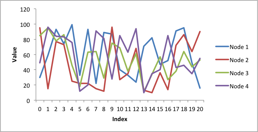
Example: Pandas Excel output with a line chart#
A simple example of converting a Pandas dataframe to an Excel file with a line chart using Pandas and XlsxWriter.
##############################################################################
#
# An example of converting a Pandas dataframe to an xlsx file with a line
# chart using Pandas and XlsxWriter.
#
# SPDX-License-Identifier: BSD-2-Clause
#
# Copyright (c) 2013-2025, John McNamara, jmcnamara@cpan.org
#

import random

import pandas as pd

# Create some sample data to plot.
categories = ["Node 1", "Node 2", "Node 3", "Node 4"]
index_1 = range(0, 21, 1)
multi_iter1 = {"index": index_1}

for category in categories:
    multi_iter1[category] = [random.randint(10, 100) for x in index_1]

# Create a Pandas dataframe from the data.
index_2 = multi_iter1.pop("index")
df = pd.DataFrame(multi_iter1, index=index_2)
df = df.reindex(columns=sorted(df.columns))

# Create a Pandas Excel writer using XlsxWriter as the engine.
sheet_name = "Sheet1"
writer = pd.ExcelWriter("pandas_chart_line.xlsx", engine="xlsxwriter")
df.to_excel(writer, sheet_name=sheet_name)

# Access the XlsxWriter workbook and worksheet objects from the dataframe.
workbook = writer.book
worksheet = writer.sheets[sheet_name]

# Get the dimensions of the dataframe.
(max_row, max_col) = df.shape

# Create a chart object.
chart = workbook.add_chart({"type": "line"})

# Configure the series of the chart from the dataframe data.
for i in range(len(categories)):
    col = i + 1
    chart.add_series(
        {
            "name": ["Sheet1", 0, col],
            "categories": ["Sheet1", 1, 0, max_row, 0],
            "values": ["Sheet1", 1, col, max_row, col],
        }
    )

# Configure the chart axes.
chart.set_x_axis({"name": "Index"})
chart.set_y_axis({"name": "Value", "major_gridlines": {"visible": False}})

# Insert the chart into the worksheet.
worksheet.insert_chart(1, 6, chart)

# Close the Pandas Excel writer and output the Excel file.
writer.close()