Example: Clustered Chart#
Example of creating a clustered Excel chart where there are two levels of category on the X axis.
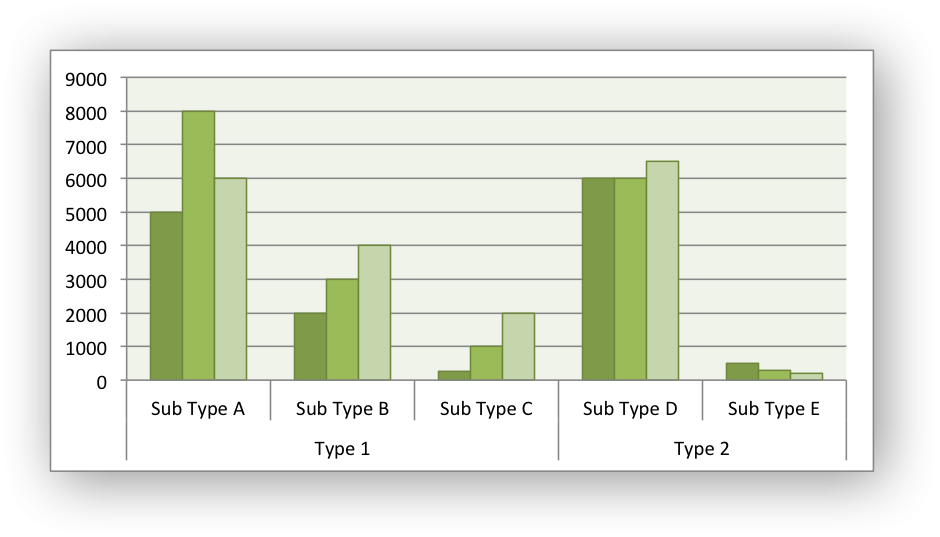
The categories in clustered charts are 2D ranges, instead of the more normal 1D ranges. The series are shown as formula strings for clarity but you can also use the a list syntax.
#######################################################################
#
# A demo of a clustered category chart in XlsxWriter.
#
# SPDX-License-Identifier: BSD-2-Clause
#
# Copyright (c) 2013-2025, John McNamara, jmcnamara@cpan.org
#
from xlsxwriter.workbook import Workbook

workbook = Workbook("chart_clustered.xlsx")
worksheet = workbook.add_worksheet()
bold = workbook.add_format({"bold": 1})

# Add the worksheet data that the charts will refer to.
headings = ["Types", "Sub Type", "Value 1", "Value 2", "Value 3"]
data = [
    ["Type 1", "Sub Type A", 5000, 8000, 6000],
    ["", "Sub Type B", 2000, 3000, 4000],
    ["", "Sub Type C", 250, 1000, 2000],
    ["Type 2", "Sub Type D", 6000, 6000, 6500],
    ["", "Sub Type E", 500, 300, 200],
]

worksheet.write_row("A1", headings, bold)

for row_num, row_data in enumerate(data):
    worksheet.write_row(row_num + 1, 0, row_data)

# Create a new chart object. In this case an embedded chart.
chart = workbook.add_chart({"type": "column"})

# Configure the series. Note, that the categories are 2D ranges (from column A
# to column B). This creates the clusters. The series are shown as formula
# strings for clarity but you can also use the list syntax. See the docs.
chart.add_series(
    {
        "categories": "=Sheet1!$A$2:$B$6",
        "values": "=Sheet1!$C$2:$C$6",
    }
)

chart.add_series(
    {
        "categories": "=Sheet1!$A$2:$B$6",
        "values": "=Sheet1!$D$2:$D$6",
    }
)

chart.add_series(
    {
        "categories": "=Sheet1!$A$2:$B$6",
        "values": "=Sheet1!$E$2:$E$6",
    }
)

# Set the Excel chart style.
chart.set_style(37)

# Turn off the legend.
chart.set_legend({"position": "none"})

# Insert the chart into the worksheet.
worksheet.insert_chart("G3", chart)

workbook.close()