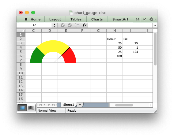
Example: Gauge Chart#
A Gauge Chart isn’t a native chart type in Excel. It is constructed by combining a doughnut chart and a pie chart and by using some non-filled elements. This example follows the following online example of how to create a Gauge Chart in Excel: https://www.excel-easy.com/examples/gauge-chart.html
#######################################################################
#
# An example of creating a Gauge Chart in Excel with Python and XlsxWriter.
#
# A Gauge Chart isn't a native chart type in Excel. It is constructed by
# combining a doughnut chart and a pie chart and by using some non-filled
# elements. This example follows the following online example of how to create
# a Gauge Chart in Excel: https://www.excel-easy.com/examples/gauge-chart.html
#
# SPDX-License-Identifier: BSD-2-Clause
#
# Copyright (c) 2013-2025, John McNamara, jmcnamara@cpan.org
#
import xlsxwriter

workbook = xlsxwriter.Workbook("chart_gauge.xlsx")
worksheet = workbook.add_worksheet()

chart_doughnut = workbook.add_chart({"type": "doughnut"})
chart_pie = workbook.add_chart({"type": "pie"})

# Add some data for the Doughnut and Pie charts. This is set up so the
# gauge goes from 0-100. It is initially set at 75%.
worksheet.write_column("H2", ["Donut", 25, 50, 25, 100])
worksheet.write_column("I2", ["Pie", 75, 1, "=200-I4-I3"])

# Configure the doughnut chart as the background for the gauge.
chart_doughnut.add_series(
    {
        "name": "=Sheet1!$H$2",
        "values": "=Sheet1!$H$3:$H$6",
        "points": [
            {"fill": {"color": "green"}},
            {"fill": {"color": "yellow"}},
            {"fill": {"color": "red"}},
            {"fill": {"none": True}},
        ],
    }
)

# Rotate chart so the gauge parts are above the horizontal.
chart_doughnut.set_rotation(270)

# Turn off the chart legend.
chart_doughnut.set_legend({"none": True})

# Turn off the chart fill and border.
chart_doughnut.set_chartarea(
    {
        "border": {"none": True},
        "fill": {"none": True},
    }
)

# Configure the pie chart as the needle for the gauge.
chart_pie.add_series(
    {
        "name": "=Sheet1!$I$2",
        "values": "=Sheet1!$I$3:$I$6",
        "points": [
            {"fill": {"none": True}},
            {"fill": {"color": "black"}},
            {"fill": {"none": True}},
        ],
    }
)

# Rotate the pie chart/needle to align with the doughnut/gauge.
chart_pie.set_rotation(270)

# Combine the pie and doughnut charts.
chart_doughnut.combine(chart_pie)

# Insert the chart into the worksheet.
worksheet.insert_chart("A1", chart_doughnut)

workbook.close()