Example: Chart (Simple)#
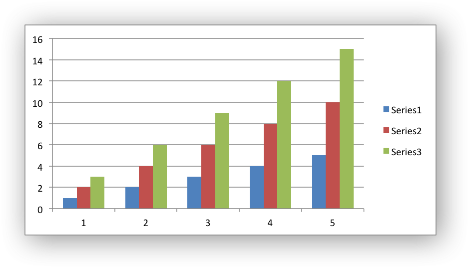
Example of a simple column chart with 3 data series:
See the The Chart Class and Working with Charts for more details.
#######################################################################
#
# An example of a simple Excel chart with Python and XlsxWriter.
#
# SPDX-License-Identifier: BSD-2-Clause
#
# Copyright (c) 2013-2025, John McNamara, jmcnamara@cpan.org
#
import xlsxwriter

workbook = xlsxwriter.Workbook("chart.xlsx")
worksheet = workbook.add_worksheet()

# Create a new Chart object.
chart = workbook.add_chart({"type": "column"})

# Write some data to add to plot on the chart.
data = [
    [1, 2, 3, 4, 5],
    [2, 4, 6, 8, 10],
    [3, 6, 9, 12, 15],
]

worksheet.write_column("A1", data[0])
worksheet.write_column("B1", data[1])
worksheet.write_column("C1", data[2])

# Configure the charts. In simplest case we just add some data series.
chart.add_series({"values": "=Sheet1!$A$1:$A$5"})
chart.add_series({"values": "=Sheet1!$B$1:$B$5"})
chart.add_series({"values": "=Sheet1!$C$1:$C$5"})

# Insert the chart into the worksheet.
worksheet.insert_chart("A7", chart)

workbook.close()