Example: Chart with Pattern Fills#
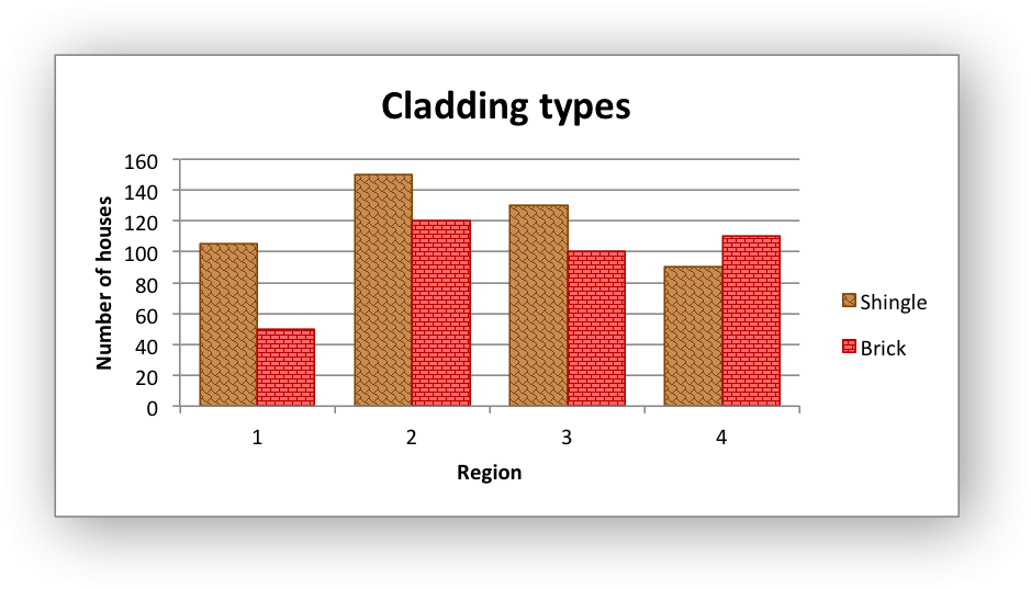
Example of creating an Excel chart with pattern fills, in the columns.
#######################################################################
#
# An example of an Excel chart with patterns using Python and XlsxWriter.
#
# SPDX-License-Identifier: BSD-2-Clause
#
# Copyright (c) 2013-2025, John McNamara, jmcnamara@cpan.org
#
import xlsxwriter

workbook = xlsxwriter.Workbook("chart_pattern.xlsx")
worksheet = workbook.add_worksheet()
bold = workbook.add_format({"bold": 1})

# Add the worksheet data that the charts will refer to.
headings = ["Shingle", "Brick"]
data = [
    [105, 150, 130, 90],
    [50, 120, 100, 110],
]

worksheet.write_row("A1", headings, bold)
worksheet.write_column("A2", data[0])
worksheet.write_column("B2", data[1])

# Create a new Chart object.
chart = workbook.add_chart({"type": "column"})

# Configure the charts. Add two series with patterns. The gap is used to make
# the patterns more visible.
chart.add_series(
    {
        "name": "=Sheet1!$A$1",
        "values": "=Sheet1!$A$2:$A$5",
        "pattern": {"pattern": "shingle", "fg_color": "#804000", "bg_color": "#c68c53"},
        "border": {"color": "#804000"},
        "gap": 70,
    }
)

chart.add_series(
    {
        "name": "=Sheet1!$B$1",
        "values": "=Sheet1!$B$2:$B$5",
        "pattern": {
            "pattern": "horizontal_brick",
            "fg_color": "#b30000",
            "bg_color": "#ff6666",
        },
        "border": {"color": "#b30000"},
    }
)

# Add a chart title and some axis labels.
chart.set_title({"name": "Cladding types"})
chart.set_x_axis({"name": "Region"})
chart.set_y_axis({"name": "Number of houses"})

# Insert the chart into the worksheet.
worksheet.insert_chart("D2", chart)

workbook.close()