Example: Chart with Gradient Fills#
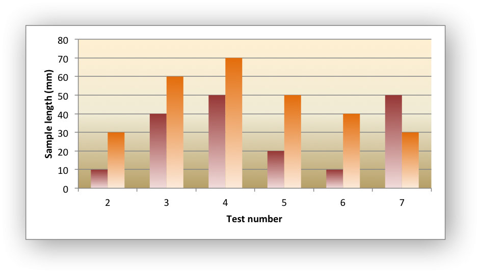
Example of creating an Excel chart with gradient fills, in the columns and in the plot area.
#######################################################################
#
# An example of creating an Excel charts with gradient fills using
# Python and XlsxWriter.
#
# SPDX-License-Identifier: BSD-2-Clause
#
# Copyright (c) 2013-2025, John McNamara, jmcnamara@cpan.org
#
import xlsxwriter

workbook = xlsxwriter.Workbook("chart_gradient.xlsx")
worksheet = workbook.add_worksheet()
bold = workbook.add_format({"bold": 1})

# Add the worksheet data that the charts will refer to.
headings = ["Number", "Batch 1", "Batch 2"]
data = [
    [2, 3, 4, 5, 6, 7],
    [10, 40, 50, 20, 10, 50],
    [30, 60, 70, 50, 40, 30],
]

worksheet.write_row("A1", headings, bold)
worksheet.write_column("A2", data[0])
worksheet.write_column("B2", data[1])
worksheet.write_column("C2", data[2])


# Create a new column chart.
chart = workbook.add_chart({"type": "column"})

# Configure the first series, including a gradient.
chart.add_series(
    {
        "name": "=Sheet1!$B$1",
        "categories": "=Sheet1!$A$2:$A$7",
        "values": "=Sheet1!$B$2:$B$7",
        "gradient": {"colors": ["#963735", "#F1DCDB"]},
    }
)

# Configure the second series, including a gradient.
chart.add_series(
    {
        "name": "=Sheet1!$C$1",
        "categories": "=Sheet1!$A$2:$A$7",
        "values": "=Sheet1!$C$2:$C$7",
        "gradient": {"colors": ["#E36C0A", "#FCEADA"]},
    }
)

# Set a gradient for the plotarea.
chart.set_plotarea({"gradient": {"colors": ["#FFEFD1", "#F0EBD5", "#B69F66"]}})


# Add some axis labels.
chart.set_x_axis({"name": "Test number"})
chart.set_y_axis({"name": "Sample length (mm)"})

# Turn off the chart legend.
chart.set_legend({"none": True})

# Insert the chart into the worksheet.
worksheet.insert_chart("E2", chart)

workbook.close()